Can you imagine a website administrator having to access the server via FTP just to update a picture or description on the website? And if it’s an eCommerce website? I can’t either.
Any website has an administration dashboard of some sort. And we are positive that every successful website has a well-thought-out, functional dashboard UI design.
What’s a Good Dashboard UI
There are dozens of ready-made one-for-all content management systems on the market. Which offer a default dashboard to fit any website. So why would you want to design a custom solution? Well, because clients want a user interface that will precisely fit their specific business needs. Where there’s nothing extra. And nothing is lacking.
And that’s what a good dashboard UI really is. It is an extremely functional space. Which fits the business like a glove. And allows the admins to spend as little time on managing the website as possible. So every tab, every button, every tiniest piece of functionality has to serve a purpose. And be exactly where the user expects it to be.
You can not achieve that with a default dashboard UI.
How to Design a Perfect Dashboard UI for a Client
So, we’ve established that a perfect dashboard user interface comes from the business goals. But how exactly do you create a perfect design for that? Here’s how we do it at Fulcrum.
Understand the Users’ Needs
Before the designer starts sketching we need to understand what exactly our admin dashboard will have. For that we need to clearly see the users’ needs. We do a thorough research of the client’s business, their goals, and the problems they aim to solve. Only when we have all the information do we determine what data and functions the new dashboard will have.
This is also when we decide if there’s a need for user hierarchy. If there is, we define which user roles will need which type of access to the dashboard. And which roles will be allowed to perform which actions.
Define the Use Flow and Layout
A dashboard is usually packed with information and important functionality. So we have to make sure the use flow is well-thought-out. And the navigation is clear and easy.
The user has to be able to do any task in the interface intuitively. So we cut out the information that is not important or relevant to the use flow. And map out a layout. Principles of information architecture and hierarchy come in handy here.
Fonts and Colors
The dashboard is a functional space. It’s not a good idea to use too many fonts and colors here. They are likely to distract the user and we don’t want that. Remember – the user has to be able to perform a task as fast as possible. So we usually use one font and differentiate it with size, weight, and color.
As for the color palette, it is important to remember the color psychology. We all have preconceptions about colors. Red means bad or something to pay attention to. Green means good. And so on.
UI Elements and Icons
As with fonts and colors, we keep the icons and other elements of the interface as minimalistic as possible. You can create an attractive and functional interface even with just two styles. Just mix them according to the element’s roles.
Consistency is Important
The design has to be consistent throughout the website. Both inside the admin panel and on the front-end.
To support the consistency and for better communication within the team we create a UI kit for all our clients. As part of Fulcrum design process we develop a personalized library of components. It includes all the possible forms, buttons, and icons. The fonts and colors are also parts of the package.
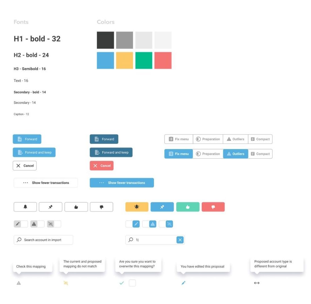 UI Kit Example
Dashboard UI Design for a Car Dealer Website
Mercedes-Benz Ukraine came to us to redesign their website. We added a lot of functionality to the website. Naturally, a big part of the renovation was the admin dashboard.
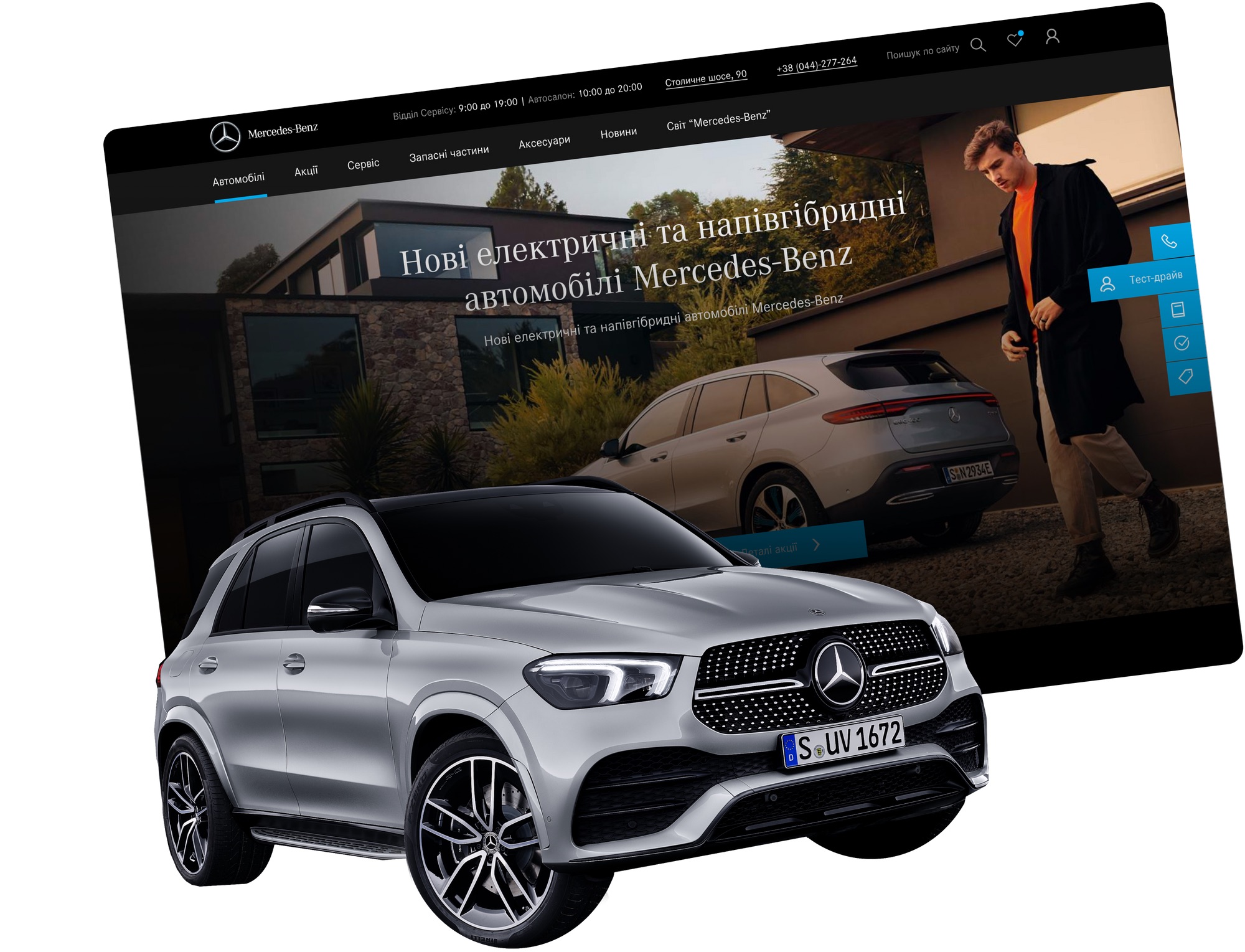 Mercedes-Benz Ukraine Redesign by Fulcrum
The client needed an extremely functional admin with multiple administrator roles. The dashboard also had to include widget administration, newsletter and SMS management.
We defined two user roles for the dashboard: read-only and admin. The read-only users can do anything except adding, editing, and deleting vehicles from the catalogue. They also can not access certain parts of the dashboard. And the admins can do anything.
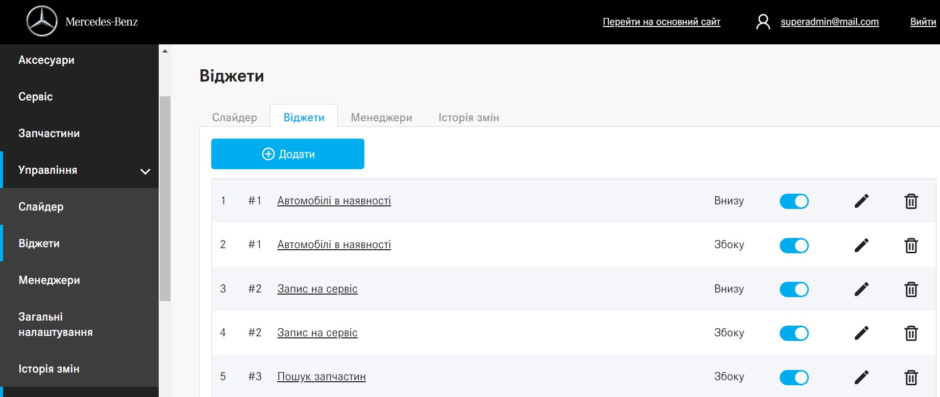
The dashboard allows to manage the website’s appearance:
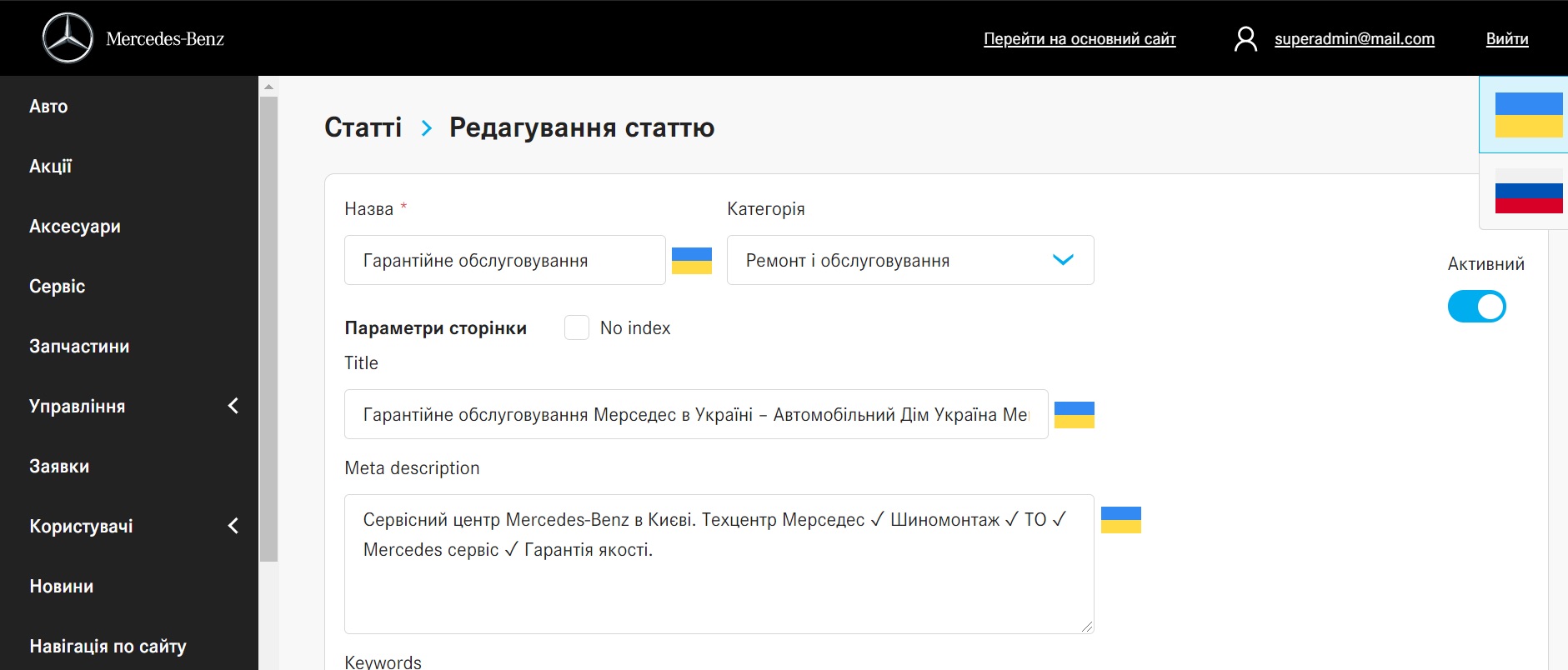
Edit articles, descriptions, and other content:
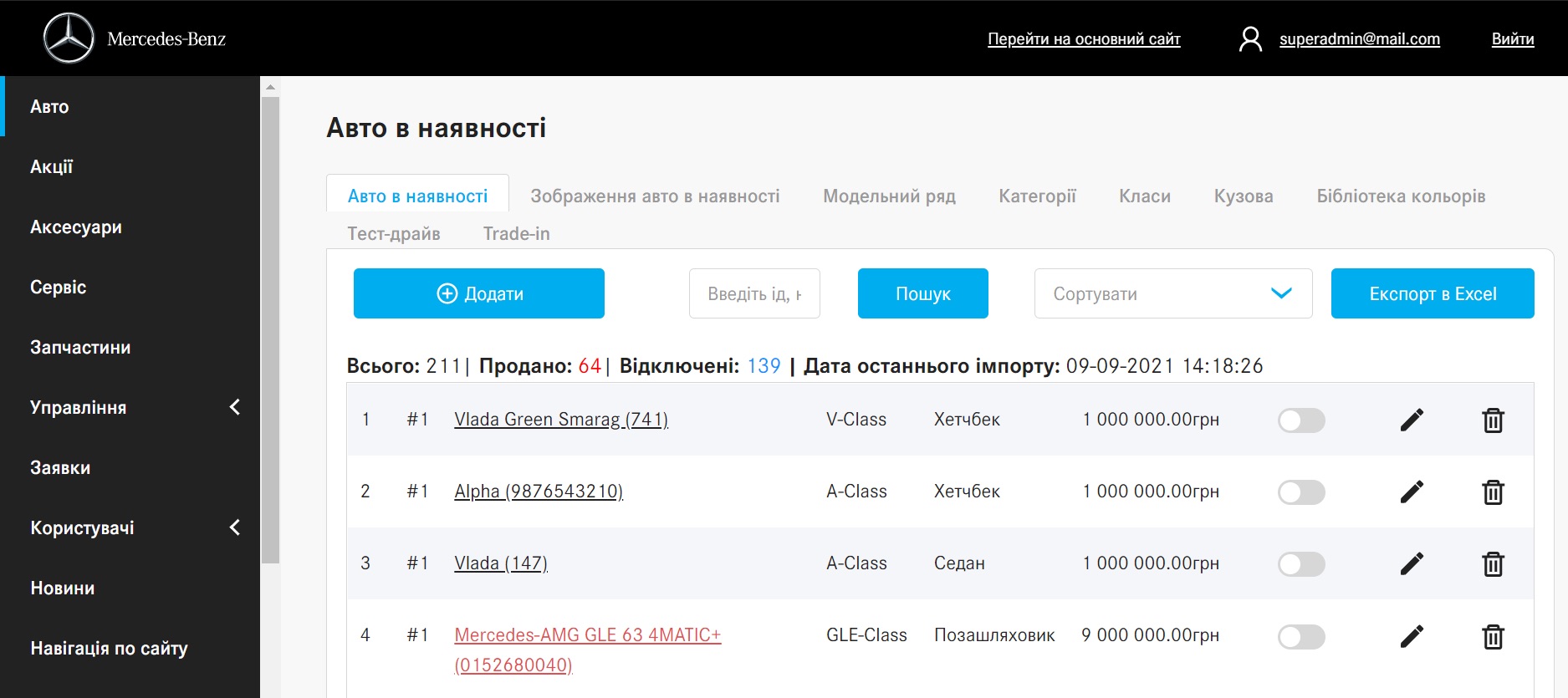
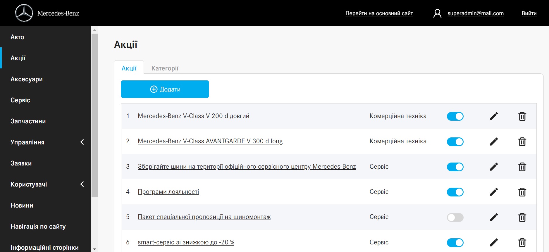
Manage the catalogue and offers:
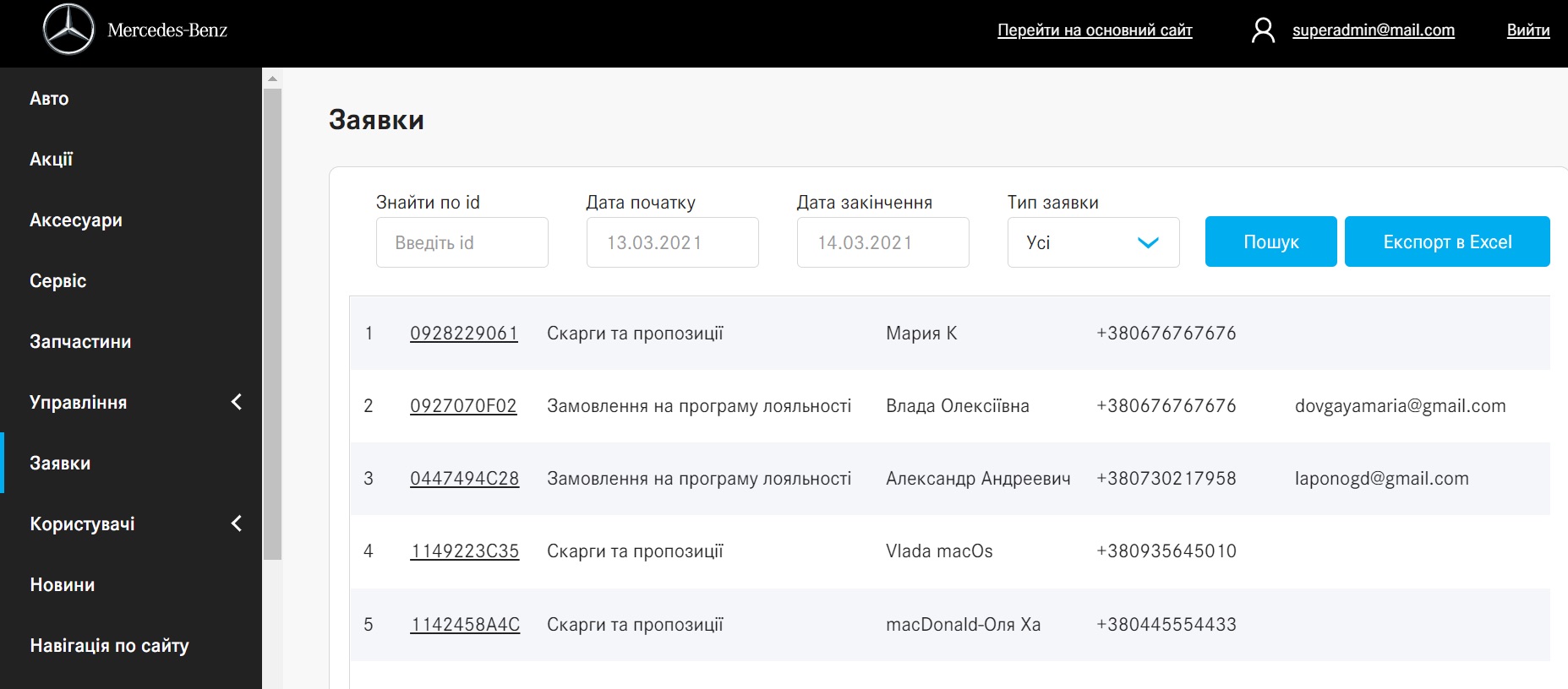
See and manage the customers’ requests:
We created a UI library for this client as well. The colors, fonts, icons, and all the elements are consistent with the branding.
Of course, an admin is only one type of dashboard. Fulcrum Rocks can do any of them. You can check our works on Behance & Dribbble.