Since the pandemic began, edtech apps have experienced a constant rise. Currently, e-learning software is among the top 3 most popular categories on the App Store and Google Play. According to the Global Online Education Market report, the industry will reach the $605 billion mark by 2027.
No wonder that the competition in such a promising industry is tremendous. Education app UI & UX design are one of a few things that make an e-learning app stand out. No more, no less – they bring or lose you users and money. That’s why we want to outline the latest education app design trends that can improve product’s user engagement, increase retention rates and get the edtech app on the next level.
The latest education app design trends
Flexibility and optimized learning are the core ideas of edutech and the latest e-learning app design trends are all connected to them. The influence of global giants like YouTube, LinkedIn, TikTok, and others hasn’t gone unmarked as well. A fine e-learning app UI design is now based on minimalism, content visualization, mobile-first practices, and much more. So, get comfy and let’s talk about edtech design trends that rock the market now:
Visualising content
The urge of visualized content in edtech is steadily increasing and modern designers know how to get edtech apps sold. They use visualized content for creating stand-alone design solutions and implement it into interactive e-learning courses to boost users’ attentiveness and engagement.
Edtech designers stress on replacing long texts with quality infographics and videos. Including visuals and other interactive elements into education mobile app design works out also great – they can represent complex ideas easier as compared to a plain text. That way users make greater progress, stay more engaged and motivated to study.
Another trending way to visualize content in e-learning is designing lectures with the help of whiteboard videos. They allow tutors to present topics while “hand drawing”, which makes the content more personal, emotional, and catchy.
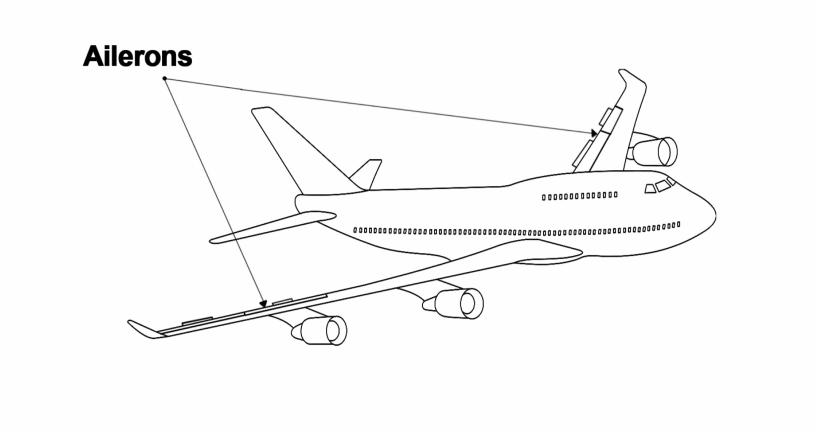 Whiteboard Video Screen
Mobile first design
When it just appeared, the edutech market was mostly desktop-oriented. However, today the pattern has changed – with approximately 60% of overall web traffic coming from mobile devices, mobile first design dominates the marketplace.
Taking a look at trending e-learning apps, we can identify two fundamental principles that can improve edtech app engagement rate:
- Focus on the page content. Due to the space restrictions on smaller screens, designers must ensure that the most essential elements are properly displayed. So, in edtech apps, designers emphasize sign up forms, personal profile menus, sections where users can explore courses and track their progress, etc.
- Provide intuitive navigation. Intuitive interface is crucial for a smooth user experience on mobile devices. Let’s take – menu items. For them, designers use navigation drawers (Hamburger menus) to present secondary elements while the main attention stays on the page’s content. That way, users can find the necessary information effortlessly.
Edtech Minimalism
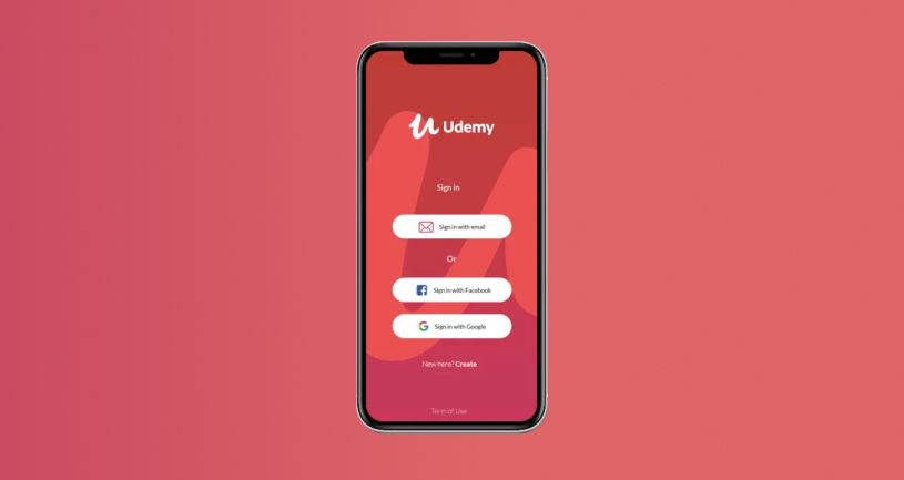
Today, most designers follow the “less is more” principle which stands for all the industries. According to this principle, an interactive design should offer and emphasize only useful information. Working on edutech apps, designers stick to simple interfaces based on open spaces and clear edges to achieve it. They also use a few bold colors instead of adding complex textures and shadows to draw users’ attention and make the essential elements like courses or lectors stand out.
Take the Udemy app – you open it and see just two buttons – ‘browse’ and ‘sign up’ along with a simple swipe menu. No less no more. A great example of the first screen that allows users to get started quickly, provides them with simple instructions and options without overwhelming their minds.
Gamification
Gaming elements in edtech design are extremely popular – education apps created with the game in mind guarantee a high level of interaction, motivation, and engagement. You may have noticed that The Khan Academy app’s skill tree, for instance, looks like the one from RPG. And there are more examples.
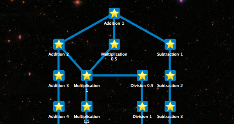 Khan Academy Skill Tree
Despite the stereotypes, gamification is beneficial for better understanding at any age. It makes edutech apps more fun and entertaining, even in environments that may appear unfitting for such a method. For instance, music theory learning or driving training apps.
Animations are common for educational app design ideas too. Most frequently, they are added for user engagement and entertainment. Designers break up lengthy courses with implementations of animated characters interacting with learners, they animate transitions between levels or lessons, add animations to loading screens, and more. Progress tracking boards, experience badges, and top user lists are also often designed using upscale animations that evoke excitement and passion for learning.
AR & VR in e-learning
The most advanced edutech apps are designed with the help of AR & VR technologies. VR & AR interfaces can be configured based on topics, particular users’ needs, and other parameters designers and developers may include. That way, users can perform routine tasks much quicker and what’s most important – they won’t be bored doing it.
Using these technologies in education app design is especially useful for children. Imagine being the first generation who get to study nature without building images using imagination. Now, children can take a close look at a blue whale or volcanic eruption.
One important thing to mention is that VR & AR devices are still fancy expensive technologies that many people cannot afford. Literally, they are used by a relatively small group of people. Thus, when implementing design ideas for projects based on these technologies, managers try not to focus on them too much. However, this may change very soon.
Personalization
Today, designers focus on creating UX that simplifies user journey, and one of the latest trends to improve edtech app retention rate is personalization of the process.
A fresh UX trend in edutech is to let users customize courses themselves. Designers create interfaces that in a few taps allow switching difficulty levels, deadlines, number of tasks, lengths of lectures, etc.
Many popular e-learning apps are designed to gather user feedback in an interactive way during courses. For example, Coursera integrates surveys in-between lessons to adapt the content to users’ individual needs and achieve greater customer satisfaction and product usability.
Dark mode
As mobile first approach sets trends in edutech design, dark mode has become an essential implementation. Currently, about 82% of smartphone users find dark mode handy and refer to it daily. They usually can adjust brightness, shades of colors, off-timers, and more. Besides, we live in a time when life isn’t attached to the time of day – a lot of people prefer learning lying in their beds late in the evening.
Navigation
Design for simple navigation is one of the key success components for any e-platform and today’s edtech trends prove it. Currently, trending edutech apps seek to design navigation elements in a minimalistic way. Basic principles are that they should be easily found and they should have a clear purpose.
A well-designed navigation in e-learning apps means users should be able to intuitively find and use sections with courses, lessons, lecturers, and progress. Typically, designers add search that includes these and other filters based on the app’s specifics.
Design trends in different app types
Today, there are thousands of edtech app design examples. Let’s look at the most popular educational app types and list their trending design elements.
Remote tuition
These apps link tutors with students in a remote learning process. Designing such apps requires a minimalistic approach – the less destructive elements an interface includes, the more focus on the educational content remains.
Apps for kids
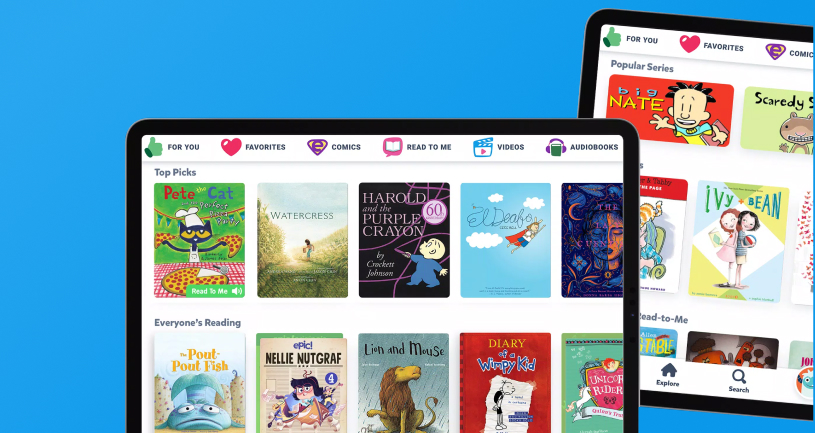
E-learning apps are admired by parents, who want to make their children’s screen time worthwhile. E learning mobile app design for kids typically imply gamification elements, including lots of animations, 3d elements, characters interacting with the user, and others.
An excellent example here is Epic! It’s a digital reading platform for kids. The app is fun, kid-safe, and interactive. It fuels curiosity and reading confidence with instant, anytime access to a vast library of books, audiobooks, learning videos, and more.
 Epic App
Language learning
Adults and kids can use these apps as they have many entertaining and gaming design elements yet assure comprehensive learning at different levels. Language learning app design implies the use of 3d buttons, animated transitions, and interactive characters.
Grading apps
Tests and regular checks are a part of the educational flow. In modern edutech, designers commonly use multiple-choice and short questions enhanced with animations, sounds, and gradients to check users’ progress while entertaining them.
Fulcrum design approaches in edtech
Here’s a fact about trends: you can’t follow them all at once. We can tell because we have some experience in educational app design. We’d like to present a couple examples of our e-learning projects and share the things we kept in mind designing them.
Kör driving e-school
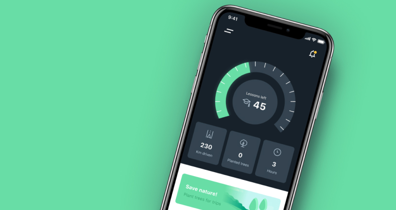
Kör is the first Norwegian digital school for drivers that lets users book driving programs and lessons online, keeps track of their progress, and allows family and friends to be involved in the process.
As the app was intended for more mature & already motivated audiences, we didn’t need to think about the way to entertain the users. So, we designed the app focusing on a minimalistic intuitive interface, implementing user-friendly infographics, simple colors, and elements.
 Kör driving e-school
VUCit coach app
VUCit is a scientifically based mental & skill self-training application that empowers users to excel professionally. We used agile methods and principles from design thinking, behavioral sciences and positive psychology to create it. VUC^it automatically generates challenges for each user based on personalized assessment & onboarding.
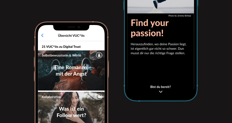
As the app launched facing the pandemic, we emphasized personalization and socialization so that users could set up a comfortable workspace and make necessary connections during the remote times. Also, we designed a section with answers from other users connected through tasks & challenges where people can comment, share and support each other all the way through the training.
Corporate e-learning with DOiT
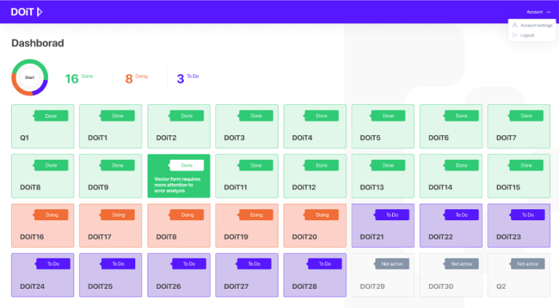
Another education app design example is DOiT – an adaptive e-learning platform meant for internal corporate usage. It is similar to edtech platforms like Coursera and Udemy.
For the app, we designed and implemented interactive assignment cards called DOiTs. Depending on the screen, they can be used to watch videos, listen to audios, mark checkboxes, choose answers using radio buttons, add text, and upload files. We’ve designed the app that way to provide our client with a simple and efficient tool for corporate learning.
Sum Up
As current edutech app trends formed under the influence of big e-commerce companies, we’re sure that the future of edtech is yet more amazing. Latest e-learning apps become more functional and engaging, while offering simpler interfaces and increased capacities. And design elements, as you can see, are essential for a fully-fledged e-learning app that fulfills business goals and meets the audiences needs.
Moreover, due to the variety and difficulty of elements common to modern edutech design not every education app development company can bring a client’s initial idea to life. However, there are platforms like Behance, Dribble where people can explore education mobile app templates and contact the agencies who created them.
FAQ: Education App Design
-
How does learning apps differ from other mobile apps?Nowadays, learning apps differ from each other. However, if we take the trends we’ve just discussed, it looks like a lot of them include features common for social networks or games. Still, there are unique functions you can find nowhere else. So, decide for yourself.
-
How can I monetize service-learning apps?Start out with getting on top of App Store and Google Play rankings. Also, try the following:
Subscription: This seems to be the more popular monetization method, with many apps using this model.
Free trial: This feature offers users a full range of content for a limited period. Best suitable for service-focused programs and allows brands to earn revenue regularly.
Free membership: This option offers users limited access to content. It may also help gain a large user base fast.
Ads: Earn by selling data-driven advertising space in your educational mobile app development. You can do this independently, or you could operate with a mobile ad partner. This might backfire as ads are annoying and could generate user dissatisfaction. To ensure this doesn't happen, limit the number of ads and take ads that are in line with your app.
Paid App: This is a "pay before play" business model. The payment for the app is made upfront, even before the download. Paid apps can cost between $0.99 to $999.99, and brands make money in advance with every download.
In-App Purchases: This is when users pay for exciting features. Whatever your app sells, make sure the in-app purchases are a regular part of the experience.
Certificates:Paying for courses is another option to consider in monetizing your app. A lot of online learning apps are using this to generate revenue. You reward users for completing courses, and they return for more with their mates.
-
I’ve got an idea, where should I start?Great! Сontact us and let’s talk about it.

