Recently, we’ve worked on a website redesign project for Mercedes-Benz Ukraine. As you understand, I know the ins and outs of the development process and share some of them with you 🙂
We will break the whole project down, go all the way of our dream team, and cover the pitfalls. So, if we get the next offer from BMW, we will redesign their car dealer website with your eyes shut!
Fasten your seatbelts, we already warmed up!
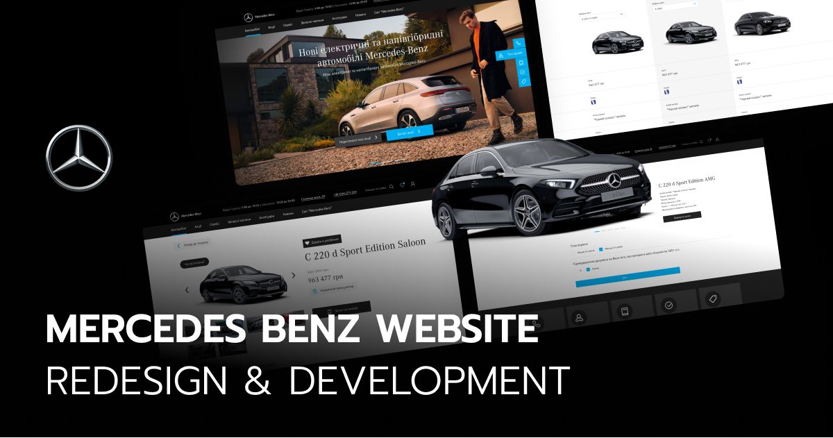
Who is the client and why did he reach out to us
Our client is the official dealer that sells and maintains Mercedes-Benz cars. This is the only Mercedes-Benz certified body repair center in Ukraine.
Why did he reach out to Fulcrum? The client wanted a customized website for his car dealership. He used a default Mercedes website inherited from the importer. Hence, there was no way to communicate with online clients more interactively.
Were there real problems with the website? Yes.
- A complicated customer journey.
- A twisty road to relevant cars & deals.
- A complicated test-drive option.
- No loan calculator.
- No accessories eCommerce store.
- No personalized approach for customers.
- A tricky road to order services.
- Low conversion rate.
Instead of the friendly eCommerce store, there was a PDF catalog, btw. There was no pricing and no opportunity to order online. The client had to make a phone call like in old times.
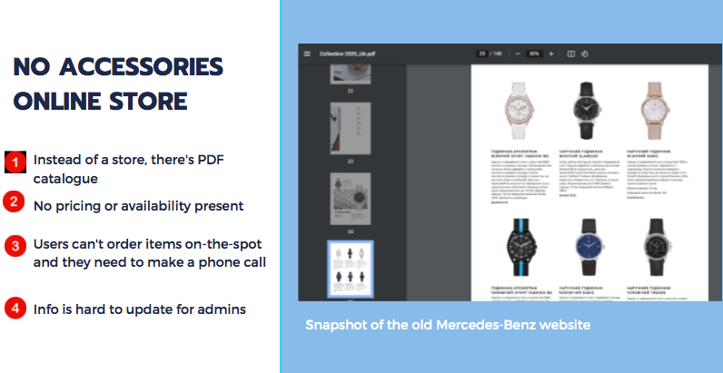
When someone creates a PDF catalog without prices and a shopping cart, one UI/UX designer cries somewhere… What we had to do (our objectives):
- Increase the up-sales of accessories and parts.
- Manage supply chain with personalized offers for relevant clients.
- Increase brand loyalty.
- Get rid of unnecessary steps before the buying decision.
- Increase effectiveness of marketing activities with a personalized approach.
Key features every car dealership website should have
A splendid car dealership website should present the cars and accessories most attractively in regards to the client’s status. Moreover, it should be stuffed but not flooded with needed elements to support every client’s step of the customer journey.
Let’s talk about its main features!
Auto Loan Calculator
An auto loan calculator on the car dealership website can help increase sales. How? Well, imagine a conversation between the potential customer and the website:
-Wow! I’d love to buy this car but I can’t afford to pay for it immediately…
-No problem, dude! Here is our auto loan calculator. Choose a car, state how much you can pay as a down payment, choose a loan term and a bank. Then, see how much you will pay for your dream car monthly! Not that much, is it?
-Yeah, I can afford it…
-Cool, then, leave your email and our representatives will contact you in a while!
A loan calculator helps compare loan offers, calculate the monthly payment, find the best deal – a benefit for users. It helps keep the customers engaged with a website and simplifies lead generation – a benefit for the client.
Here is the calculator that we developed for Mercedes-Benz Ukraine:
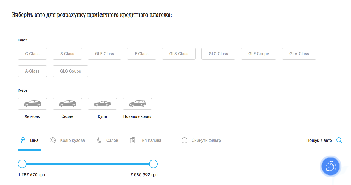
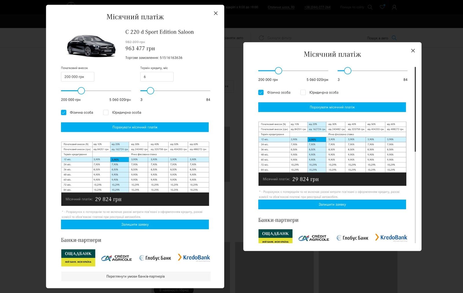
The customer will calculate the monthly payment stating the:
- down payment;
- loan term;
- vehicle price;
- bank;
- physical or legal person.
The formula for calculating:
A monthly payment = Loan amount * ( (1 + annual interest rate / 12 / 100) ˄ loan term (months) * annual interest rate / 12 / 100) / ( (1 + annual interest rate / 12 / 100) ˄ loan term (months) – 1)
Loan amount = vehicle price – down payment
Then, the customer can leave a request for feedback from the dealership. The representative will get an email with this request, which will be also saved in the admin panel. Cool, isn’t it?
The right amount of photos and videos of the vehicle
How can visuals increase sales? First and foremost they can eliminate any doubts about the purchase. The right photo will make a potential customer think “OMG, I want to be this guy in the driver’s seat!”. Eventually, he should become a customer.
The visuals should present the vehicle professionally – from different, attractive angles. There should be photos of the details (a control panel, lightning system, wheels, etc).
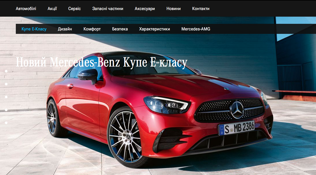
Comfortable admin panel
What is a perfect admin panel?
It’s a customizable admin panel. It gives full control over its options and features. It allows customizing a website without external assistance. It has two types of the user’s role:
Read-only. The user can do anything except for:
- adding, editing, or deleting vehicles
- accessing the following menu items:
- Individual page management.
- Widget management.
- Main page feed management.
- SEO.
- Backups.
- Contextual suggestion management.
Admin. The user can do anything.
Opportunity to schedule a test drive appointment
This is a must-have option and it should be convenient. Let’s compare good examples vs. not really good ones. What we had:
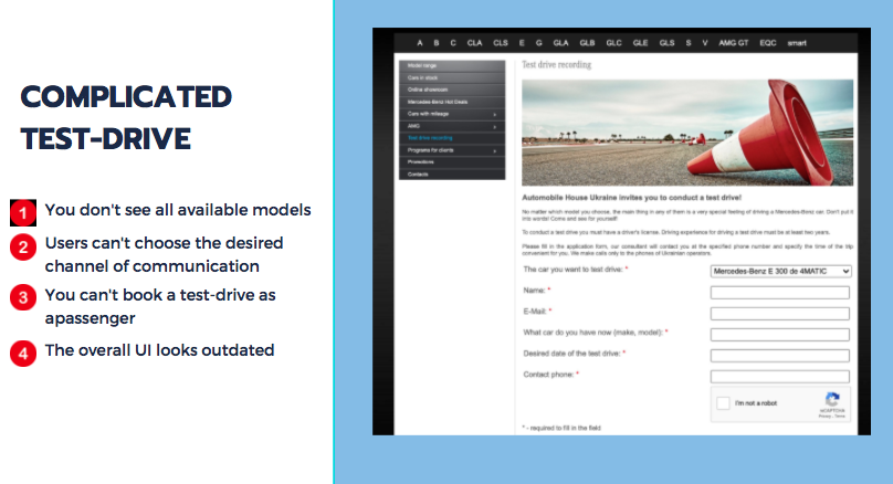
What are the problems:
- No opportunity to see all available options.
- No opportunity to choose the channel of communication.
- No opportunity to book a test drive as a passenger.
Plus, the UI looks outdated, doesn’t it? What we got:
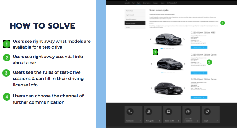
The new design allows the users to:
- See all models available for a test-drive.
- See all essential information about the car.
- See the test-drive rules.
- Leave their driving license information.
- Choose the channel of communication.
Opportunity to compare vehicles
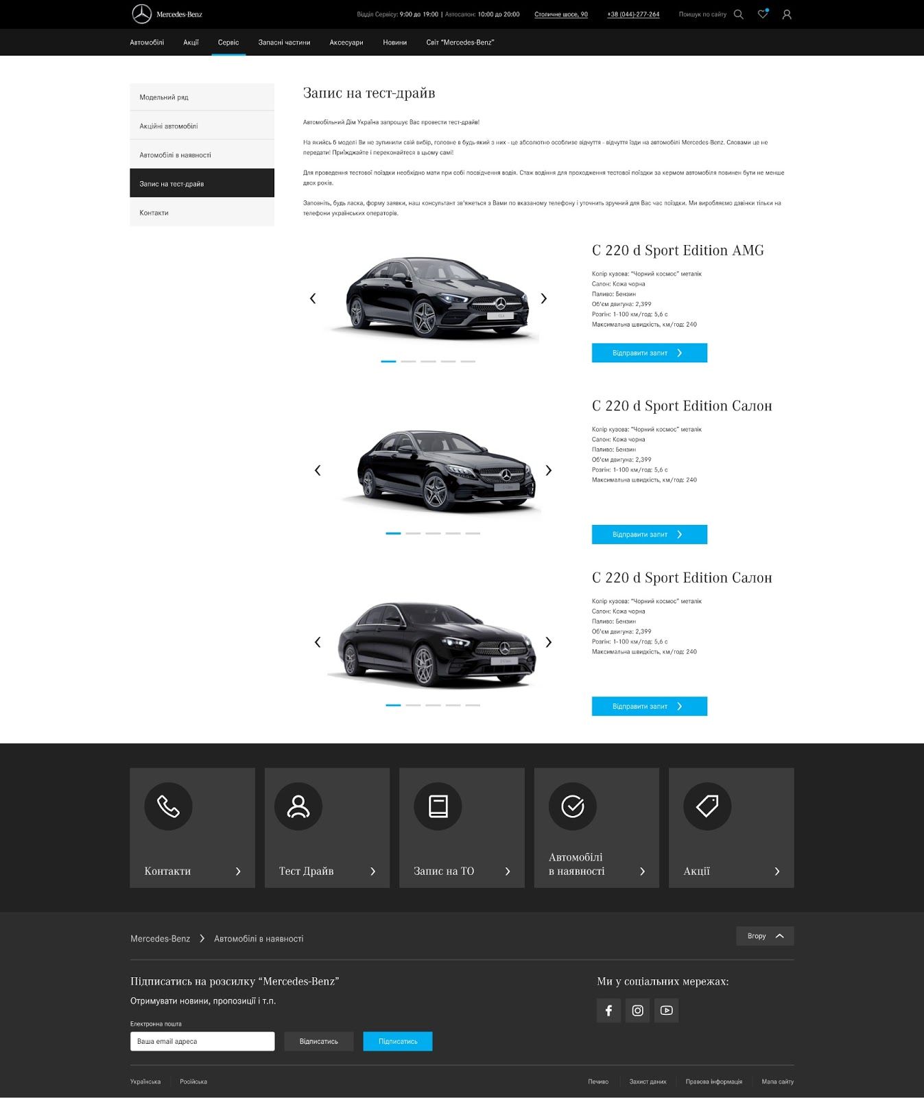
This simple tool helps weigh the pros and cons of the vehicles conveniently and effectively – a benefit for the customer. It also makes them engage on a website and move to the next step – schedule a test drive, contact the dealership, request any information. It’s a benefit for the client. How we did it:
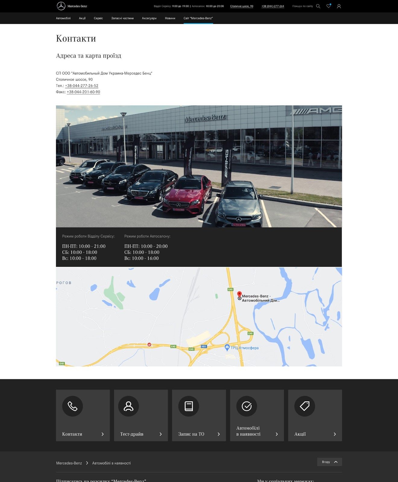
Contact information
The order value on a car dealership website is high – don’t make the client wait or God forbid get nervous. What should be included hands down:
- a contact number;
- location, address, and a map;
- opening hours;
- a contact form and an email (don’t write off introverts).
How we did it:
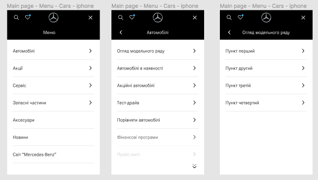
Another important thing to point out is convenient navigation, logical site structure, and a good sitemap. Time is money. Your money. So, make sure the visitors of the website will find what they search for and pay for it.
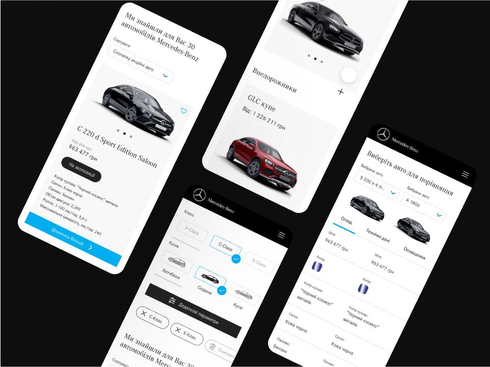
Logical and intuitive system of filters to choose a vehicle
Remember that the website’s search engine shows results according to the keyword in the inquiry. It searches across all the website’s pages – information and catalog.
We’d recommend showing the results on a separate page, using paging, and the preview of the search result (an image and a title).
Filter the results according to the type of content (information or catalog).
How we did it for the Mercedes-Benz Ukraine website:
Don’t forget to add a page with news and promos, as well as a website for vehicle reserve.
Widgets
Widget is a shortcut, a link to an existing page or section.
It has two variants:
- Small buttons on the side of the page. They have a fixed placement regardless of the user’s location on the page.
- Large buttons in the footer of the page.
You can manage widgets in the admin panel.
Two more must-haves on the car dealer website
Responsive design
You never know what gadget the visitor of the website will use. Is it Android 9 Pie or iOS 14.5? Don’t second-guess – make the website responsive! Then, it will look good and work correctly on all gadgets, in all operating systems.
Responsiveness is also important for SEO. The more responsive is the website, the higher Google will rank it. Since more than 60% of automobile searches come from Google… You know what I mean.
Initially, you can add all types of widgets (icons, names, links to certain sections or windows). Then, the administrator can remove or add a widget from the list and edit its name.
These widgets were approved by the client and the shortcuts were created:
- a form for scheduling a test drive;
- a form for making a service appointment;
- the contact us button/form (the Ringostat dial button, Viber, Telegram);
- address and a map;
- promotions;
- available vehicles;
- a loan calculator;
- spare parts;
- trade-in.
The number of widgets is fixed – 5 (on the side of the page and in the footer).
SEO optimization
A well-optimized website is more competitive, generates more traffic; hence, leads and high sales. The website becomes visible to potential customers. Do you reach the ninth or tenth page in the search results? Hardly.
Moreover, it increases the awareness, the trustworthiness of the website and gives greater authority.
What we did for SEO optimization of the Mercedes-Benz Ukraine website:
- Created breadcrumbs navigation.
- Created Sitemap.xml & Robots.txt files.
- Activated the HTTPS protocol.
- Created an Open Graph markup.
- Indexed “available vehicles” pages.
- Created meta tags and optimized content.
Too many things to do to launch a splendid website redesign, huh?
The Result:
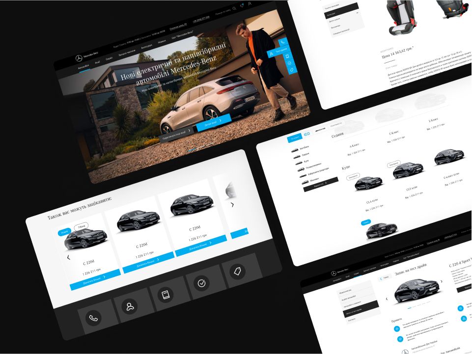
Car Dealer Website for Mercedes-Benz Ukraine
Bonus for those who read till the end! Drop a message to the Fulcrum team and we will do it for you – with thorough research, audience survey, and much more! And the website will live happily ever after.


