Organizing anything – from a small meeting with friends to a big party – might be a hassle. How to deal with it? Use the best event management software! You can either find or create it 🙂
My name is Dima, I’m a project manager at Fulcrum. Recently, we’ve released a cool project – Plannly. It’s event management software that can help to organize small and large events. Using it as an example, I will tell you how to create an irreplaceable event planner app!
A few words about Plannly
Plannly is an app that helps users to plan their social gatherings and events in 3 steps:
- Choose the type of event. Maybe coffee?
- Pick up the place. A new fancy coffeehouse around the corner?
- Decide on the date. Tomorrow after lunch?
Then, a user gets an URL that can be shared with guests. Sounds pretty simple but why is it cool?
First, it’s super intuitive. I bet you won’t get caught up in any of the steps. No good-for-nothing buttons. No one thousand and one option on the off-chance. No irritating pop-ups.
Second, it has well-thought-out user flows. Didn’t find the desired place? Type your option! Decided to make a private event? Not big of a deal! Go back a few steps and make adjustments! It’s user-friendly indeed.
Last but not least. It has a minimalistic design. We decided on a few colors – black, grey, pink, and variations of pink. They indeed look good together. And the cherry on the cake – minimalistic and straightforward icons.
Plannly is an event planner mobile app that performs its clear role. No more but also no less. But it does it really well 🙂
Now, let’s delve deeper into the details.
Must-have event management software features
An event planner mobile app without these benefits is like Starbucks without the Pumpkin Spice Latte. It’s still good but something is missing.
Here is a checklist of the must-have features:
- Quick & simple onboarding to teach users.
- Smooth & user-friendly signup and login.
- Calendar for personalized & universal events.
- Functionality to choose the type of event users are planning.
- A convenient location auto-population feature to pick the venue.
- User-friendly option to choose the time of an event.
- Universal & personalized link sharing.
- Detailed overview for each event.
But first things first.
Quick & simple onboarding
Any app or software should be intuitive – it’s axiomatic. If it’s confusing, a user gives up on it. In 2020, 25% of the users abandoned an app after one use. A complex design is one of the reasons for that.
It’s crucial to consider the user flows and provide clear setup instructions. Appropriate links, useful pop-ups, and navigations help the users to adapt. Overloading features don’t help but confuse the users.
What did we do for Plannly? We decided not to overwhelm users with features they will hardly use. Instead, users meet the new information gradually as they proceed in planning. Alongside, they get navigations for what they are currently exploring.
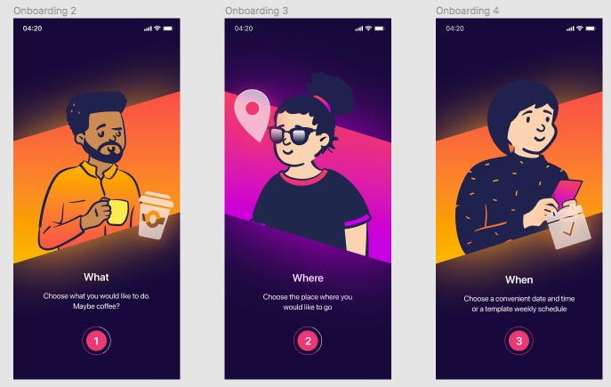
Onboarding is an important part of the UX. To organize it, you should understand the user’s journey from point A to point B. At Fulcrum, we pay huuuge attention to the UX audit. As a result, much love from the satisfied users 🙂
Smooth & user-friendly signup and login
Another thing that can chase off the users at the first stage is confusing login and signup forms. Keep them simple. Keep the number of fields to a minimum. Believe me, signup and login aren’t the most important things. They are only doors to the main functionality. The quicker the user will find the key, the faster he will explore it.
For Plannly, we limited the signup steps to leaving the number, the first name, and the email as the sine qua non. Want to add a photo? You are welcome 🙂
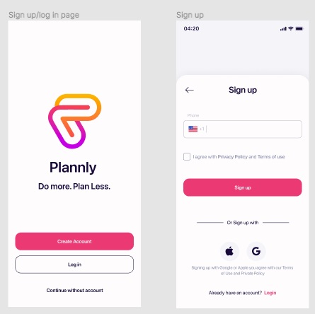
To log in, the user should use his number. He can also log in or sign up with an Apple ID or a Google account.
To provide security, the user should enter the code from the SMS after signup and every login.
What I wouldn’t recommend is overdoing with security. Captcha at every turn, confirmation of the password and email will only irritate the user unless you are the SNB 🙂
Calendar for personalized & universal events
A calendar in an event planner app is like the Eiffel Tower in Paris. Tourists come to Paris and expect to see it. Users download an app and know that they will find a calendar. It’s a must-have for planning after all.
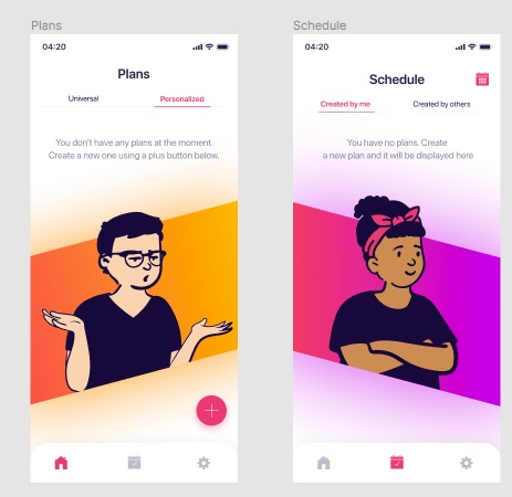
For Plannly, we developed two calendars – with your events and events you are invited to. The days with events are marked in light pink. Today’s date is marked in dark pink. If a user clicks on the date with an event, its details appear.
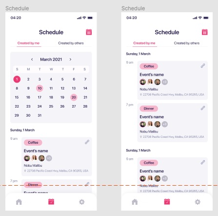
There are two types of plans. Personalized plans are one-time events (e.g a birthday party or a business meeting). These events have a duration. Universal plans are reoccurring events (Sunday brunch with a Mom or Saturday yoga with friends).
Functionality to choose the type of event users are planning
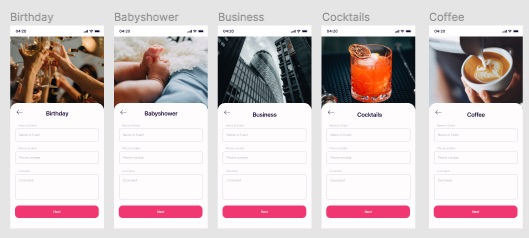
It’s cool to provide a user with a list of events but you can’t guess all crazy fantasies. Hence, we left the space for imagination. In general, the user can choose from:
- birthday;
- baby shower;
- business;
- cocktails;
- coffee;
- conference;
- dinner;
- celebration;
- lunch;
- wedding;
- personal training.
Also, it’s possible to customize every event with a specific name and a comment. Is it a birthday party in the ‘90s style? Drop a comment and your friends won’t forget about cropped tanks and flared pants!
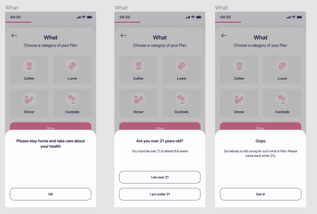
One more thing that we like about Plannly is “caring” notifications. If a user has any COVID-19 symptoms, he is recommended to stay home. Moreover, youth under 21 years old aren’t allowed to organize or attend events with cocktails, for example. Young party makers will also get notifications.
A convenient location auto-population feature to pick the venue
This is one of my fav options! Plannly syncs up to Google. Hence, when you start typing the place, the most relevant variants appear in a dropdown list. Synchronization with Google maps is a must-have.
Moreover, the app hand-delivers the best places within a 15-mile radius! You can set filters for budget, opening hours, type of food, and distance. It’s super handy when you can’t come up with a venue.
Location auto-population feature and autofill options, in general, are awesome. They give 10 points to user experience. Of course, if they work seamlessly 🙂
User-friendly option to choose the time of an event
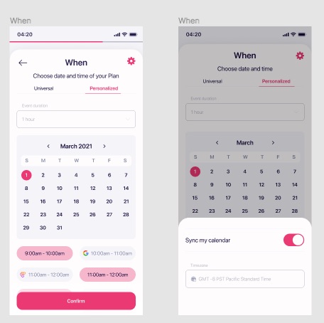
The next thing that the user will do – choose the time and the duration of the event. The user should have an opportunity to plan the date, the day, the time of the event. It should be an intuitive, step-by-step process.
That’s what we did for Plannly.
The user chooses the duration of the event, the date, and the time. 12 am – 12 pm format is available when planning beforehand. If the user organizes anything for today, he sees only actual time variants.
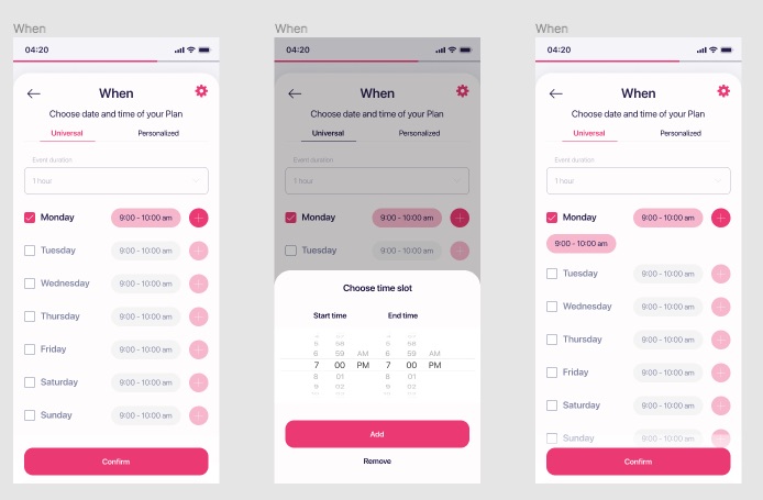
Then, he can synchronize with his calendar and won’t miss anything!

Universal & personalized link sharing
Sending invitations is an important function of any event planner app. Celebrating a birthday party without the man of the hour isn’t much fun, is it? Therefore, make sure that this feature is thoroughly tested.
That’s how it works in Plannly:
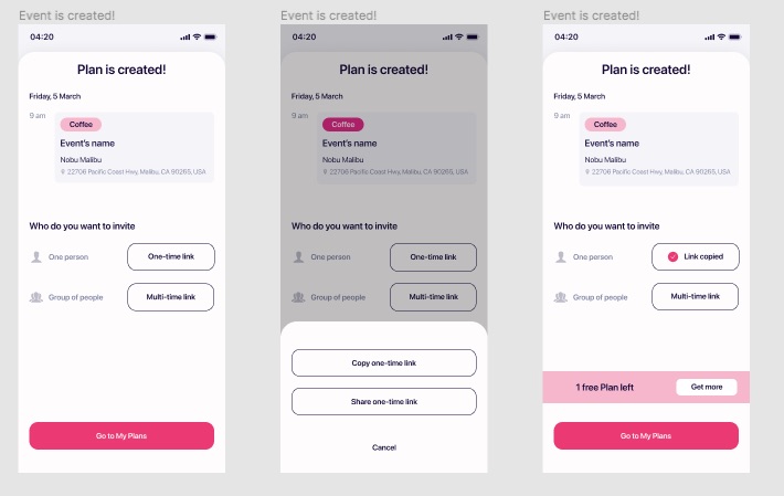
The user can create a link for one person or a group of guests. Then, he can share it via messengers or messages or copy it and share it wherever he wants. Everything is light and breezy.
Detailed overview for each event
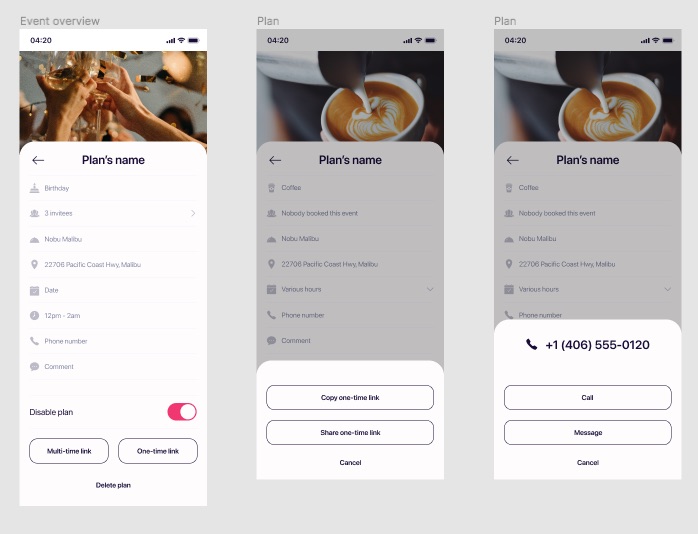
Last but definitely not least – reviewing the plan. At this stage, the user checks out if he missed anything or anyone. The design must be intuitive. The elements should be well-organized. What should be on the screen?
- name of the event;
- time;
- place and address;
- guests;
- contacts of the organizer.
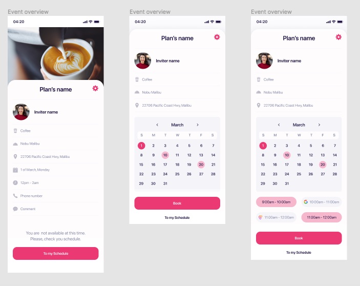
It’s awesome if, at this stage, guests can contact the organizer in a matter of a few clicks. No copy & paste functionality.
How it looks like in Plannly:
What if you are planning to create event management software?
If you read up to this point, you won a jackpot 🙂
At Fulcrum, we can create an event planner mobile app that will meet your expectations. Our attitude to software development is responsible and accurate. Each feature is discussed with regard to necessity and potential benefit. At the end of the day, each feature – time and resources for development.
How do we choose an optimal set of functions? We decide on it during and thanks to the Discovery Stage. At this time, the magic happens. We do detailed research of the market niche, competitors, and opportunities.
As a result, we get valuable information that helps to outline the development process.
So, have an idea and want to realize it? Awesome! Drop us a message and let’s have some fun!
Best Event Management Software FAQ
-
What is the best event management software?It’s software that simplifies the event management process. It has enough functionality to plan big and small events. Using it, you can choose the event time, pick up a place, choose the time and the duration, leave comments, and invite guests. With it, you can also track events you were invited to.
-
What is the event planner app?It’s event management software on your smartphone or tablet. The best one should be easy to use. It should have an intuitive, user-friendly design. A clear, well-thought-out user’s path from point A to point B is also important. It should be stuffed with all needed options but not be overloaded.

