If Jeffrey Zeldman asked me what distinguishes a good app design from a mediocre one, I’d say that the best solutions are timeless. They can be fine-tuned to meet the fleeting trends. Overall, however, their relevance is unfailing, and reusing them is a win-win.
My name is Fedya. I’m a design team lead at Fulcrum. I passionately create designs that impress and sell. Today, I will tell you what is a cornerstone of the best app design and what trends will rock it in 2022!
First and Foremost: What’s the Best App Design
Before delving into details, let’s come to a common understanding of the best mobile app design.
The main mantra of any app designer – the best app is a functional user-friendly app. It has simple navigation. All the cool features and top-notch content is easily accessible. Functional animation clarifies navigational transitions. Smart features “illuminate” the user’s journey. The visual weight helps to draw attention to the important elements. There is no Circle of Registration and Verification Violence – minimum information is needed to sign up. An onboarding experience is well-organized, intuitive, and indeed useful. It goes on and on.
In other words, the best app has the best app UX design. It influences the user’s desire to keep on using an app, recommend it to buddies, and put five stars on the AppStore. Loyal users result in higher engagement and retention, more in-app purchases, invites or referrals, and lower churn.
Therefore, I always recommend doing UX research in the start-up phase of app development. I won’t go into great detail now because Mark (a super talented UX designer) did it before. In this article, he explains how to carry out effective UX research step by step.
Which Is a Good App Design Practice
I already took the wraps off the best app design practice a bit but let’s dwell on a few non-obvious practices to follow.
Take Inspiration from Your Colleagues
There is nothing wrong with being inspired by the works of other designers. I often check out Dribbble and Behance. I sometimes download apps and take a user journey. It gives insights into how others use UI elements, fonts, patterns or work with content. It helps to detect flaws and cool techniques. It inspires and shows professional growth zones.
Why does inspiration from others often have a pretty negative light? Probably, it’s because people often confuse it with plagiarism. But they are not the same thing, guys.
Go Old School
Sketch on paper. Yes, I’m serious about this. And I know how far technologies have come. You may be a logo painting guru with Adobe or some other tool, but old school has a lot more advantages. Good old pencil and paper takes less time and lets you unleash artistic potential.
Enable fast reversal of actions
User inputs are energy vampires. Dozens of fields to fill in. And then, one tiny mistake puts the user back to square one. Mercilessly.
The reversibility of the data entry actions should be simple. If the user makes a mistake in his last name, he shouldn’t fill out the whole form again. Thus, he won’t be afraid of making a mistake. He knows how easily he can undo it. It makes exploration of new features an existing journey.
Design Readable, Attractive, and Friendly Content
The UX design should display readable text with a suitable font. For example, the body text shouldn’t be smaller than 17pt for iOS and 16sp for Android. The text that is bigger than 18pt can hurt an app’s aesthetic. Fonts can, by the way, do the same. Hence, I’d recommend using the system fonts – San Francisco and New York for iOS and Roboto for Android. An appropriate color scheme should match the theme and message you want to convey.
Optimize Visual Content
Optimized images are a must for good app design. Things to check out: the aspect ratio, image architecture, size, and resolution. The aspect ratio must fit the screen size of the mobile devices, as well as the size of design elements and animation effects. A clear resolution is important for correct display. The size should be small enough to not slow down the load of the app content.
Adapt App Designs to Emerging Markets
A billion new online users are expected in the next couple of years. And the vast majority of them will be from emerging markets (or so-called mobile-focused countries like India, Indonesia, Brazil, and Nigeria). They will get access to the Internet via their mobile phones. These users will have different experiences and expectations from those in the US and Europe. If you want to go global, it is essential to consider their experience.
What’s next?
So here you are, holding a gadget with a masterpiece in your hand – your beloved app. You have let the whole world see that you are good with technology. It’s a piece of cake for you to understand all its features. But how do you know that users will use your app with the same ease? Well, you’ll never know unless you conduct a proper usability audit. Test your app over and over again and don’t be ashamed to ask for help.
App Design Trends that Will Rock It in 2022
Dark mode
The first and probably the hottest trend is the dark mode. You may have noticed that some of the largest companies add light and dark modes to their products. The dark mode is a low-light user interface that displays mostly dark surfaces. The two-color design trend has two significant benefits for the user. Dark themes help reduce eye strain by adjusting the screen brightness to match current lighting conditions. Also, they save mobile device battery power by reducing the use of light pixels.
That’s how Fulcrum followed this trend – check BUFF designs.
The Kawaiization in App Design
Kawaii came to us from Japan. This is a verbal way to express tender emotions. In the best app UX design, it translates into muted, soft colors, rounded shapes, unobtrusive typography. I’d oppose it with a minimalistic design.
The kawaiization has a positive effect on app design. It evokes good feelings, reassures, reduces anxiety. As it calms down nerves, the user becomes more concentrated. I love that psychological effect of cuteness. Especially, compared to cold vibes of minimalism.
We have already implemented this trend in some designs like for a Restaurant app in Kawaii style.
Cartoon Illustrations
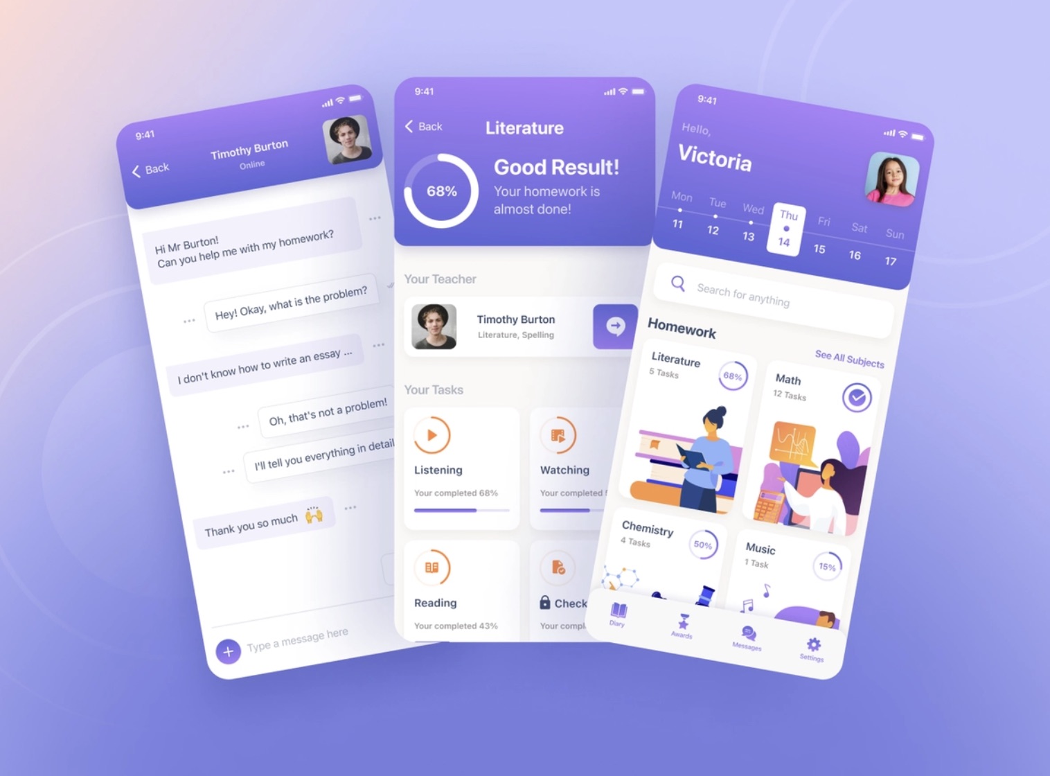
Cartoon illustrations work pretty the same way as the kawaiization. They take the users back to childhood – the period that evokes a smile (in an ideal world). It’s a powerful tool to connect with users on a more personal level. It results in higher audience engagement and loyalty.
At Fulcrum, we mostly implement cartoon illustrations as separate UI elements but I saw the cartoons on the backgrounds and they looked cool.
 A Smart School App
Data Visualization
When you present data using pictures, infographics, graphs, and other visual mediums, you pay tribute to another best app design trend – data visualization. It stays on the border of UI and UX design, information, communication, and visual communication. The goal of data visualization is to make complex data comprehendible. The users don’t want to solve riddles. Comprehensible and simple delivery of information is a priority.
That’s how we did it for a platform for booking driving programs and lessons. See more on Behance.
3D Geometric Designs
I’ve been observing the standing surge in the popularity of 3D technologies for several years. 3D geometric designs are more cost-effective than photos. Plus, the experiments of 2021 improved the skills of designers worldwide, so we will definitely see interesting realizations in 2022. Check the designs we’ve create for the Career Coaching App.
Interaction with Users
App designers will only redouble their efforts to make intimate contact with the users. Hence, the following trends will take roots even greater:
- Interactive visuals
- Gamification and animation
- Storytelling
- Using emoji
- Long reads are replaced with short forms involving visual elements
The best mobile app design is an emotional design that helps to make emotional contact with an app.
Simplicity, Style, and Usability
Many brands already focus on simplicity, style, and usability and will continue to do so to stand out from the competition. As for simplicity, the ultra-minimalistic design will be the most trendy. That is when a minimal color palette, simple shapes, and much negative space are used. Check, for example. website design for Mercedes Benz Dealership.
Who Will Help to Create the Best App UX Design
You can keep on taking wild guesses but I will give you hint – Fulcrum 🙂
The development of a quality UX/UI design is one of our primary directions.
We do not create for the sake of creating. We carefully consider all user journeys before jumping into the project. Fulcrum design services include the following services:
- Interactive Prototypes. The prototype gives you an early look at how your app should look. You will think through the correct user flow, test your app’s initial look and feel, and gather insights from potential users.
- 2D Animations. Our team is skilled at two vector-based animations. This kind of animation is used on the web, mobile, and desktop platforms.
- llustrations. Illustrations freshen up any design and give life to your app or a website.
- Design Audit. Design Audit is a thorough checkup of the app/website. We analyze all design elements you have used from different standpoints and develop detailed recommendations for your best app designs
- Final UI Design. No matter if you need a website or an app, our designers create a winning UI for your project.
Do you need a compelling design? Do not hesitate to contact the Fulcrum team to create the best app design and let your project get alive.
Conclusion
Nowadays, everyone is overloaded with a constant flow of information, so creating attention-grabbing products has become much more difficult. Your product may be valuable, but no one will spend time figuring out how to do it if it is difficult to use.
Simple, attractive, human-oriented design is the key to long-term relationships with customers. Not so long ago, having a visually appealing design was enough. But now everything has changed. The human-oriented approach in app designs has become the primary trend in 2021, and it will be trendy in 2022. If not, you will get a free UX audit in 2022.
Best App Design 2022 FAQ
-
Which is a good app design practice?Good app design practices are all about simplicity, intuitive navigation, personalized approach, and attractive images. In other words, you should strive to create a design that does not make users think much. Make sure it focuses on emotions, motivations, and needs.
-
What is the best app design software?There are many tools for prototyping and designing mobile apps that help you create beautiful products and bring them to life. Your best app design tool depends on the needs and preferences of your project. Among the most popular ones are Sketch, BuildFire, Axure RP, Origami Studio, etc. Stop your choice on the software that gets your design development to the next level.
-
How to design an app?Building a successful app design is a complex process that includes several steps. After your app idea is created and the market research is done, think over the features you want to see in your future app. Make the design mockups of your app and create its graphic design. Build a marketing plan and start creating an app. Once the product is finished and tested correctly, you are ready to submit it to the App Store.
