In June 2022, one of our customers – a gaming loyalty program BUFF – decided to run a complete design revamp. For a multimillion-user platform like BUFF, the redesign had to be as smooth and fast as possible.
Gaming loyalty program BUFF shattered the gamers’ world in 2018 with a bold idea to make a change. Next year, the platform went global with 6000 daily users from 154 countries. Today, BUFF is Israel’s first publicly traded gaming company and a real market player that has over 7 million users worldwide, runs special promotions for LEGO, Hulu, Alienware, Monster Energy, and others. Recently, we recharged its design, switching to a minimalist neon green and updating the interface.
Time to redesign gaming loyalty program BUFF
‘BUFF’s first design was created in 2018. Back then, it was engaging and innovative, with many interactive elements that created the product’s unique visual style. Over the years, a gaming loyalty program has grown into a cross-platform ecosystem with a full-fledged website, desktop, and mobile applications. Design challenges grew along’, says our designer Kate.
‘The platform evolved rapidly, offering new cool functionality and opportunities for its users, but the updates brought extra modules and overloaded screens to the app’s design system. We needed to remove all the complexity.’
What and how was done
The task took around 2 months for our team to complete. The team reviewed all aspects of the platform – from technical to business ones. To recap, we have reworked the app’s interface based on the new branding available, made it fully consistent, introduced crucial UX improvements, added new features, and switched to a template design to help the product team achieve their goals faster while saving time significantly.
Although the new branding was created by an external agency, we had one main thing to do, namely to synchronize the new branding with the web design basics and apply it to both – BUFF’s desktop and mobile versions. All these updates had to be done fast and without causing inconveniences for the existing users. We needed to introduce heavy changes in a smooth way. That’s why we hurried to implement the refreshments within less than 10 weeks.
Developing a consistent design system
Our team started with shaping the whole new consistent and efficient design system for BUFF. They reworked the platform’s hovers and buttons, along with setting a unique tone of voice for BUFF, which was decisive for digital marketing.
‘A custom unified dictionary for communication with users during marketing events and other activities was organized,’ says Yurii Zakharov, BUFF’s technical product owner at Fulcrum.
Another thing we kept in mind was how to create a loyalty app as customized and responsive as possible. So, Kate, our designer, has reworked the screens for all possible app states, which definitely increased the quality and efficiency of the updated product. The implementation of revised 3D elements was one of our key UI changes, too.
With the overhaul we also switched to a template design – for a loyalty system software like BUFF, it was resource- and time-efficient to create a templated solution. It would ensure the swiftness of the system and establish effective communication between the tech team (designers, developers) and the business team of the product.
So, our crew elaborated a consolidated system of BUFF marketing materials for business usage. As a result, the business team now has a major part of marketing visuals ready for use, while designers could leverage their time for other tasks.
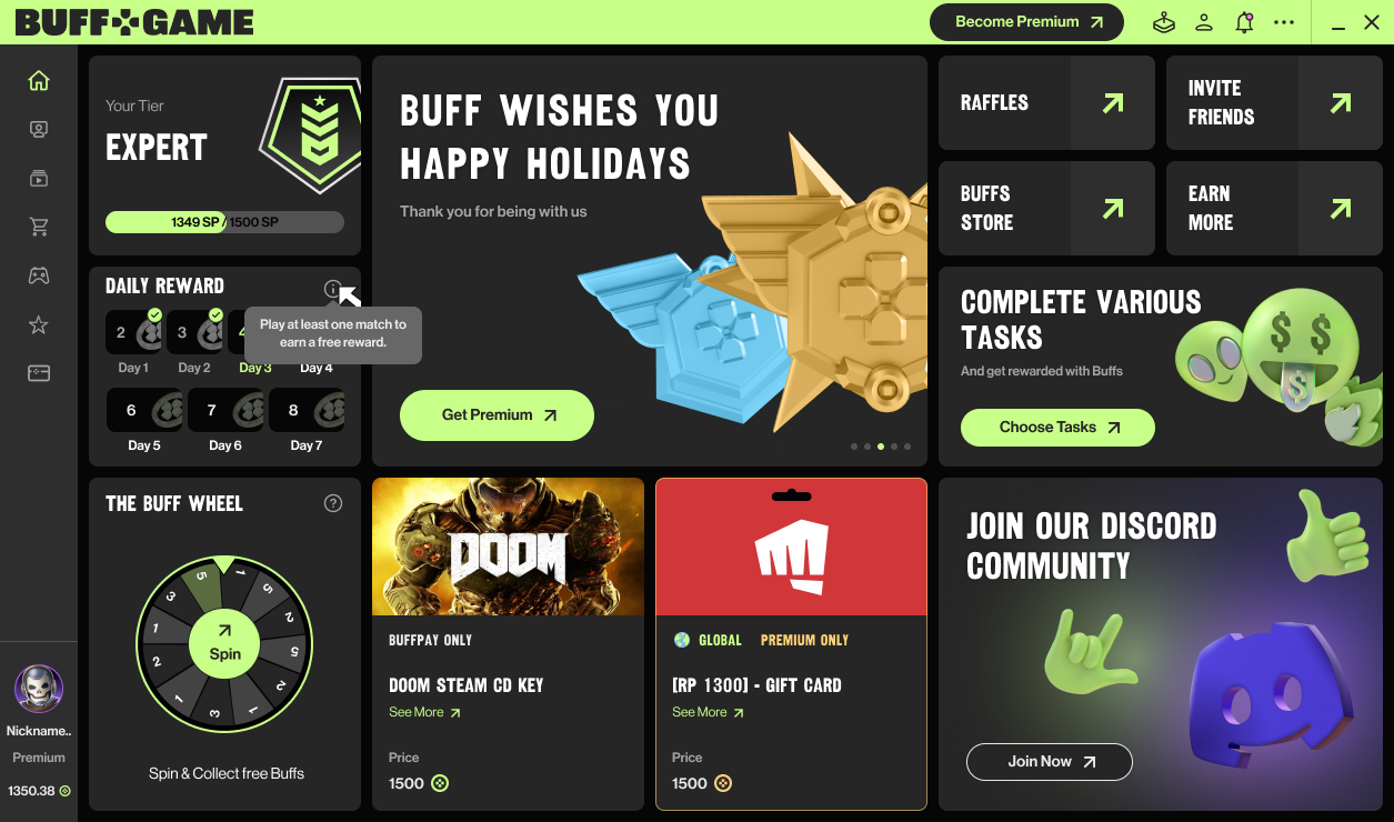
Entertainment app development & redesign are far more than the visuals. Apart from remastering the platform’s UI, we did UX changes, too. Earlier, the team ran UX research to analyze user behavior during specified actions and events. So, the redesign became a great opportunity to implement some of our findings. Like, for instance, updates of registration & sign-in flow of the app.
Social network for gamers
With this revamp, we wanted to allow BUFF to continue connecting gamers globally at a new pace. The project grew from just a loyalty platform into a social network for gamers worldwide. From a business perspective, the platform transformed into a full-fledged gaming social media platform. BUFF is no longer just a ‘play and earn’ story, it’s much more. It’s a space where gamers can interact, exchange their achievements, create gaming content, and gather friends. So, during the update, we had to enhance the existing networking features and add new ones to move in this direction.
For this purpose, our team reworked the gamer’s personal profile not only design-wise but functionally, too. Now users can set their avatars, make posts, and follow friends or other gamers while also being followed. We’ve also introduced a new Highlights function, so now users can record, edit, tag, post, like, comment, and send the best moments from their plays.
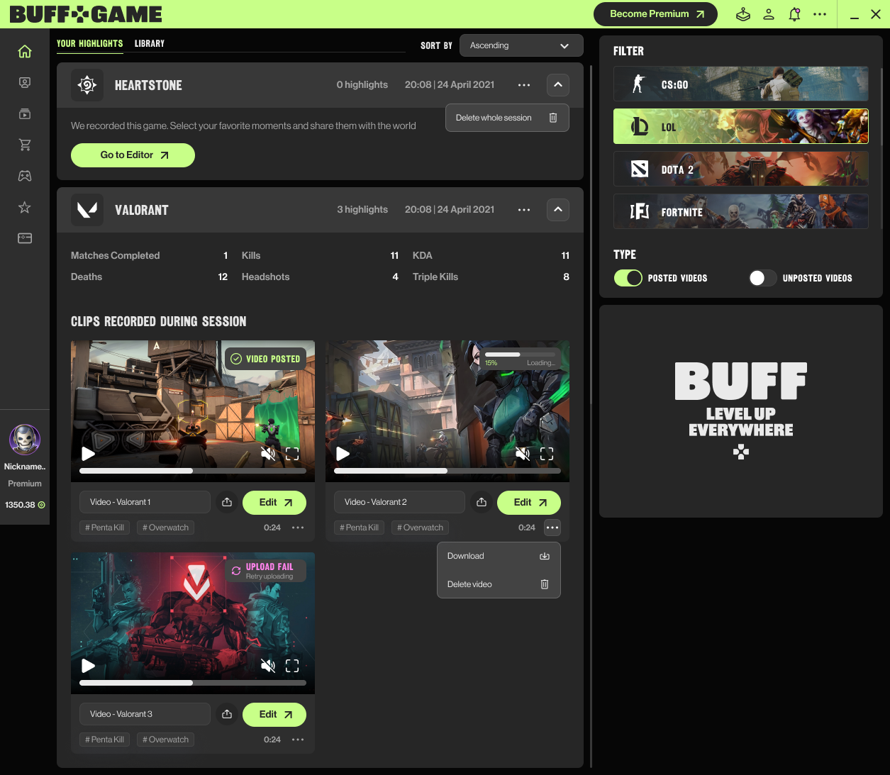
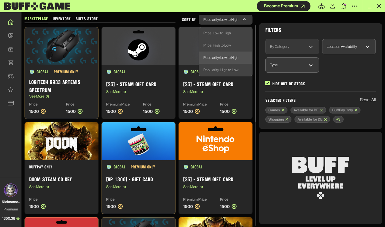
Taking care of user engagement is an essential part of a modern loyalty app development . So, as part of a redesign scope, we have reworked BUFF’s daily and weekly challenges to make them more engaging. The marketplace was remastered alongside the Premium Subscription page.
Our team ran these UI & UX changes to make the platform more consistent between different modules and simpler for users. We did not just redesign the pages, but wanted to create as much networking experience for users as possible.
Wrap-up
2 months after the redesign was completed, BUFF’s new style seems to take root. Users responded positively to the changes, the team says – shortly after the updates were introduced, we gathered user feedback. Gamers put high scores on the work done. Last but not least, with the changes, we fulfilled the main objective – offering up-to-date, consistent loyalty system software for BUFF lovers from around the world.

