When we founded Fulcrum Rocks we defined our mission as “creating products that solve important problems”’. Naturally, we built all our processes around this mission.
Today we are going to tell you how we approach design. We will describe the process model we developed. And how it supports our mission and our vision of the future.
What’s a design process model?
Let’s start with the fundamentals. What’s a design process model? To put it simply, it is a framework that helps designers plan, organize, and manage the design process and projects. Usually, this is a documented outline that visualizes every phase of the design process in some graphic form.
But why do we need a model? Can’t we just sit and design whatever it is our client needs?
Remember the Fulcrum mission we told you about at the beginning of this article? To align with the mission our design team came up with a definition of design. They define design as a process used to systematically and aesthetically solve real problems of real users. Without a framework, we would risk creating designs that do not serve our client’s business goals. We would create products that do not solve the users’ problems. And the whole process would be chaotic.
The model serves as a guide. And since it is aligned with the rest of our processes we can be sure that all the projects we work on are done in line with our mission.
Examples of models for the design process
Over the years there’s been a number of researches that documented the design process in various fields and industries. We won’t delve into every detail concerning these models. After all, this article’s focus is not on them. But let’s take a look at a couple of examples of the models found in different sources. Just so you have an idea of what we are on about.
Linear design process model
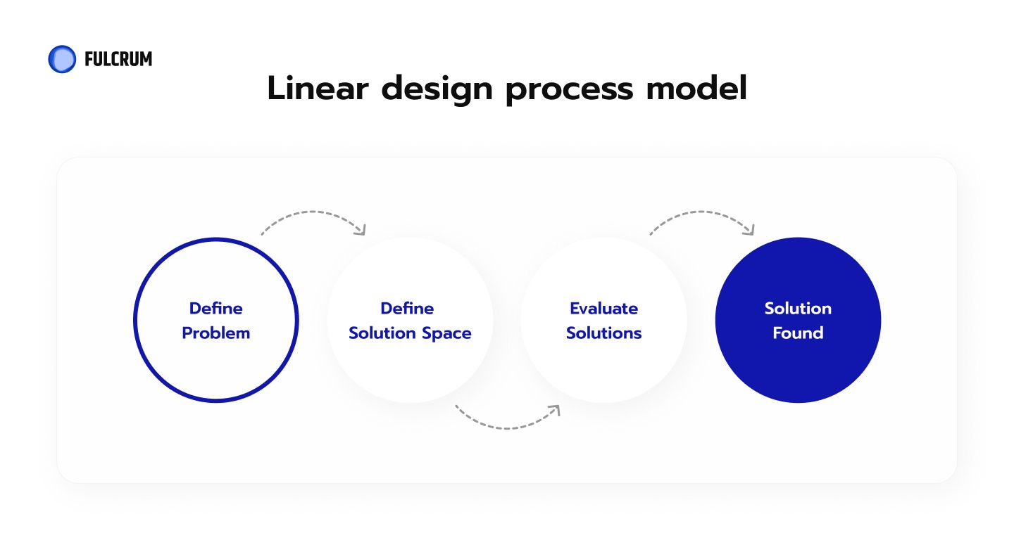
The linear model implies that each phase has to be completed before the next one can begin.
V-Model
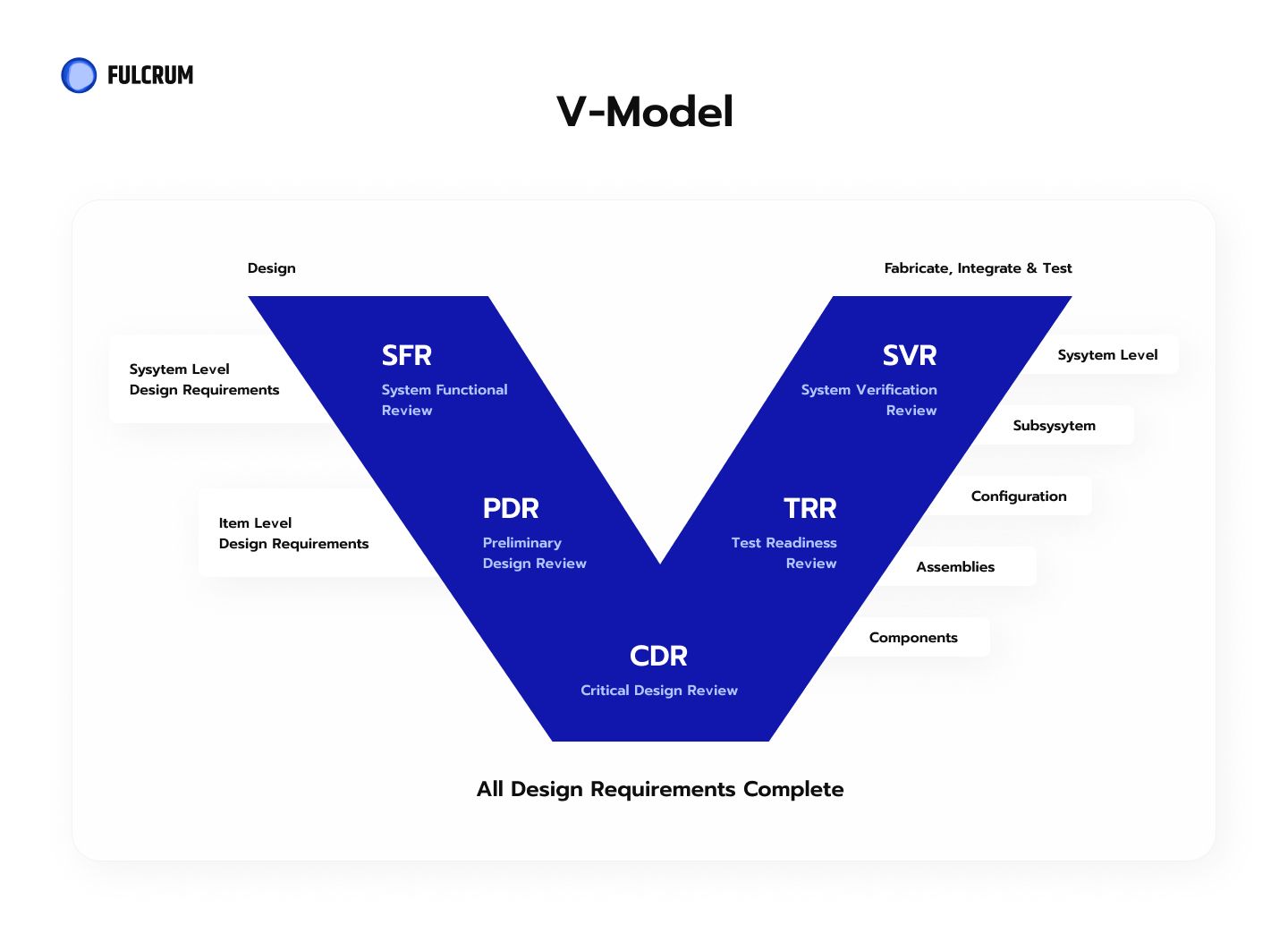
On the left side of the V we have the creation of the specifications. And evaluation and analysis of the requirements. On the right there’s integration and validation.
ADDIE
ADDIE stands for Analyse, Design, Develop, Implement, Evaluate. The phases are not necessarily linear. The model allows for coming back to any of the phases at any time.
User-Centered Design
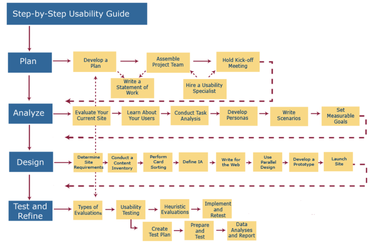
Developed by Usability.gov, the user-centered design model has 4 steps:
- plan;
- analyze;
- design;
- test and refine.
Each step has sub-steps, methods to fulfill, and succession order.
Double Diamond Design
As you might guess from the title of this article, the double diamond model of design deserves more of your attention. Let’s have a closer look at it.
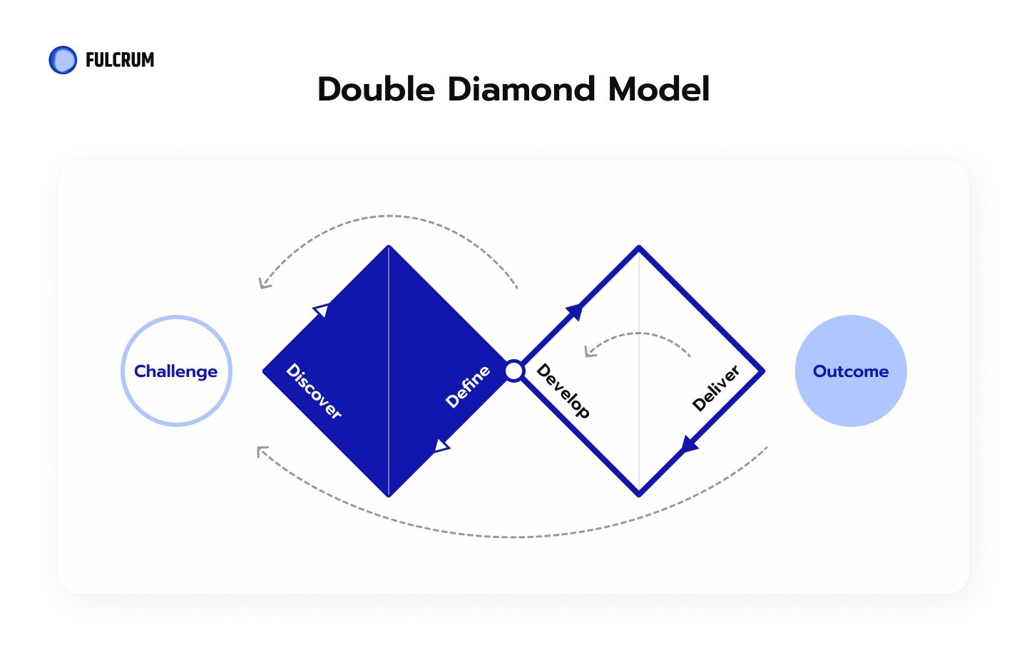
The British Design Council defined the double diamond design process in 2005. They came up with the model following a comprehensive study of the design process of major companies. Yahoo, Starbax, Sony, Lego, Microsoft and others took part in the study.
What the Council was after was the understanding of how creatives process information to deliver solutions. And they were astonished to find out that people in all these companies went through essentially the same steps. Yes, each company had their own name for the process and the steps it consisted of. And yes, each company did it in their own particular way. Using different instruments. But the creatives in these companies all went through these steps.
So the Council analysed the process and formalised its steps. According to the Double Diamond model the design process should consist of:
- Discover phase: understand what the problem actually is. Not assume. The phase entails speaking with the users. Spending time with the people who are directly affected by the problem the design is meant to solve.
- Define phase: The insights accumulated from the discovery phase can help see the problem more clearly. So defining the actual problem becomes possible.
- Develop phase: When the problem is clearly defined it’s time to find different solutions to it. It involves looking for inspiration from different sources. And co-designing with different people, who are not necessarily designers themselves.
- Deliver phase: This phase entails testing the solutions. Rejecting the ones that do not work. And perfecting those that do.
The process is not linear as you can see from the diagram above. Moreover, the Council encourages the creatives to flow freely between the phases. This should help to understand every angle of the problem and find better solutions.
Fulcrum’s version of the double diamond framework
To be completely honest with you – we did not know any of the above information when we first started forming our design process. We realised we need to formalise what we are already doing. That’s when we found the info and were shocked to recognise our own design process model in the double diamond.
We divide our process into two phases: discovery and ideation. These two phases are divided into two substeps each:
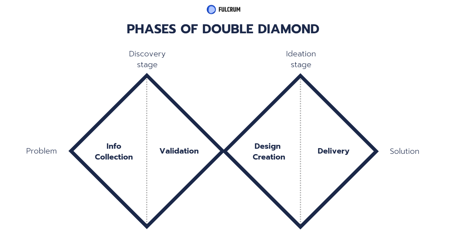
Let’s look at each step in more detail.
Info collection
When the client comes to us with a problem they want a solution to, we start with collecting all the information on the upcoming project. We use various sources, methods, and tools for this.
At this stage we prepare a workspace in all the tools the project will require (Figma, Miro, Notion, etc.).
Kick-off meeting
The designer has an Inner Kick-off Meeting with colleagues who know more about the project. He needs to write down the important information: restrictions, client wishes, etc.
Research and workshop preparation
After the initial info is collected at the kick-off meeting, we delve deeper into the product we will work on. The designer figures out how the product works, completes the main flows by himself. If there’s no product yet the designer goes through similar flows from the competitors. He might run a UX audit of the existing product.
This is also when we prepare for a workshop which comes next. The designer creates a workshop template, prepares questions for the client, and comes up with first hypotheses. He also gathers references and a list of direct and indirect competitors.
Vision workshop
This is an interactive session held with all the stakeholders. Including the client and every member of the team that will work on the project. The main goal of the workshop is to come up with the general vision of the product to come. Having this vision helps us work better with the client’s expectations, plan our work, and focus on the business needs. After this session we have:
- product vision;
- user needs and pains;
- limitations and challenges;
- customer expectations;
- value proposition;
- instant feedback for the first hypothesis;
- design strategy.
Survey and analytics
The initial phase is when we gather all the info we can. So we hold online surveys with the existing or potential users. This helps us formulate hypotheses and discover high-level insights. And we gather quantitative data as well. Using tools like HotJar analytics and Google Analytics. From these quantitative reports we phrase even more hypotheses. And define the KPIs for the success rate.
Information validation
Remember the Fulcrum mission? We aim to create products that solve important problems. But how do we know if the problems we solve do exist? We validate the hypotheses we came up with at the info collection step.
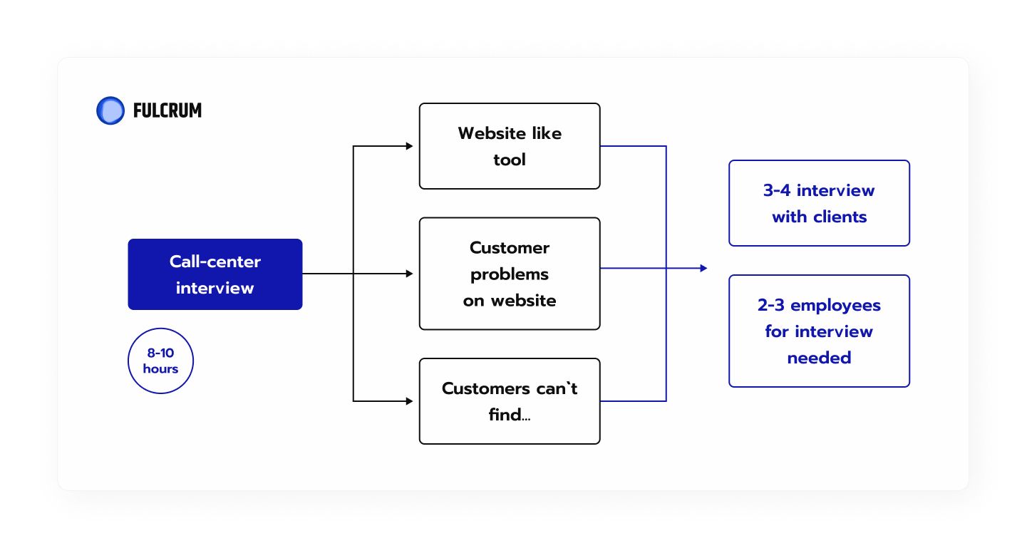
Minimum 5 user interviews
User interviews are a great UX research method. We take our hypotheses and phrase questions from them. Then we ask these questions to the real users. By the end of the interviews we have a list of:
- insights;
- pains;
- needs;
- ideas;
- motives.
Customer profile
Based on the interviews we highlight common points that will need to be taken into account in the design ideation process. As a result we have customer profiles for different use cases, patterns of behaviours, and list of insights.
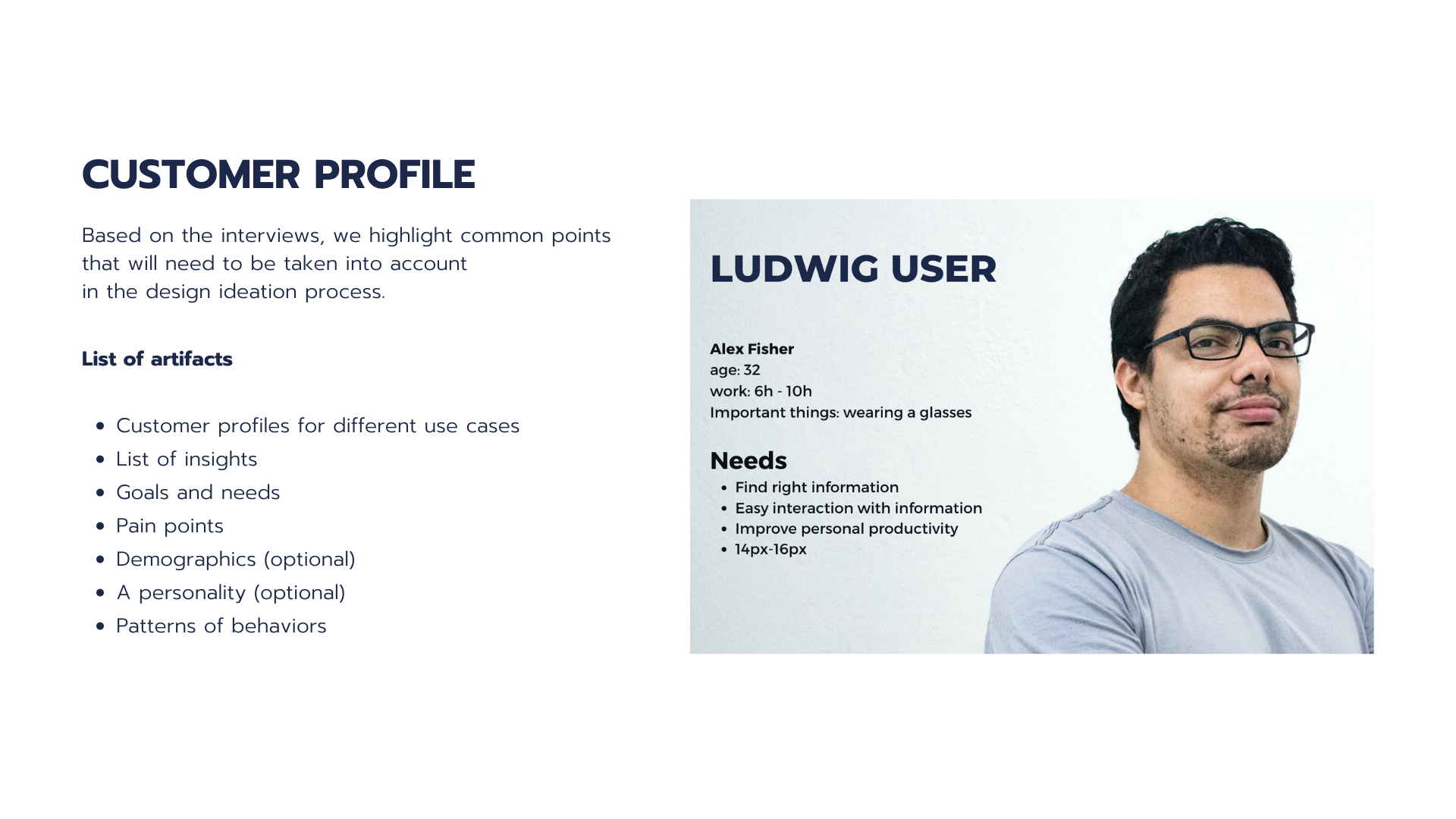
Here we can also create personalities and demographics. But these are optional and depend on the project needs.
Competitors research
In the previous stage we did perfunctory research of competitors. Now we need to delve deeper. A good competitor analysis can significantly speed up development. And inspire the design team with new creative ideas.
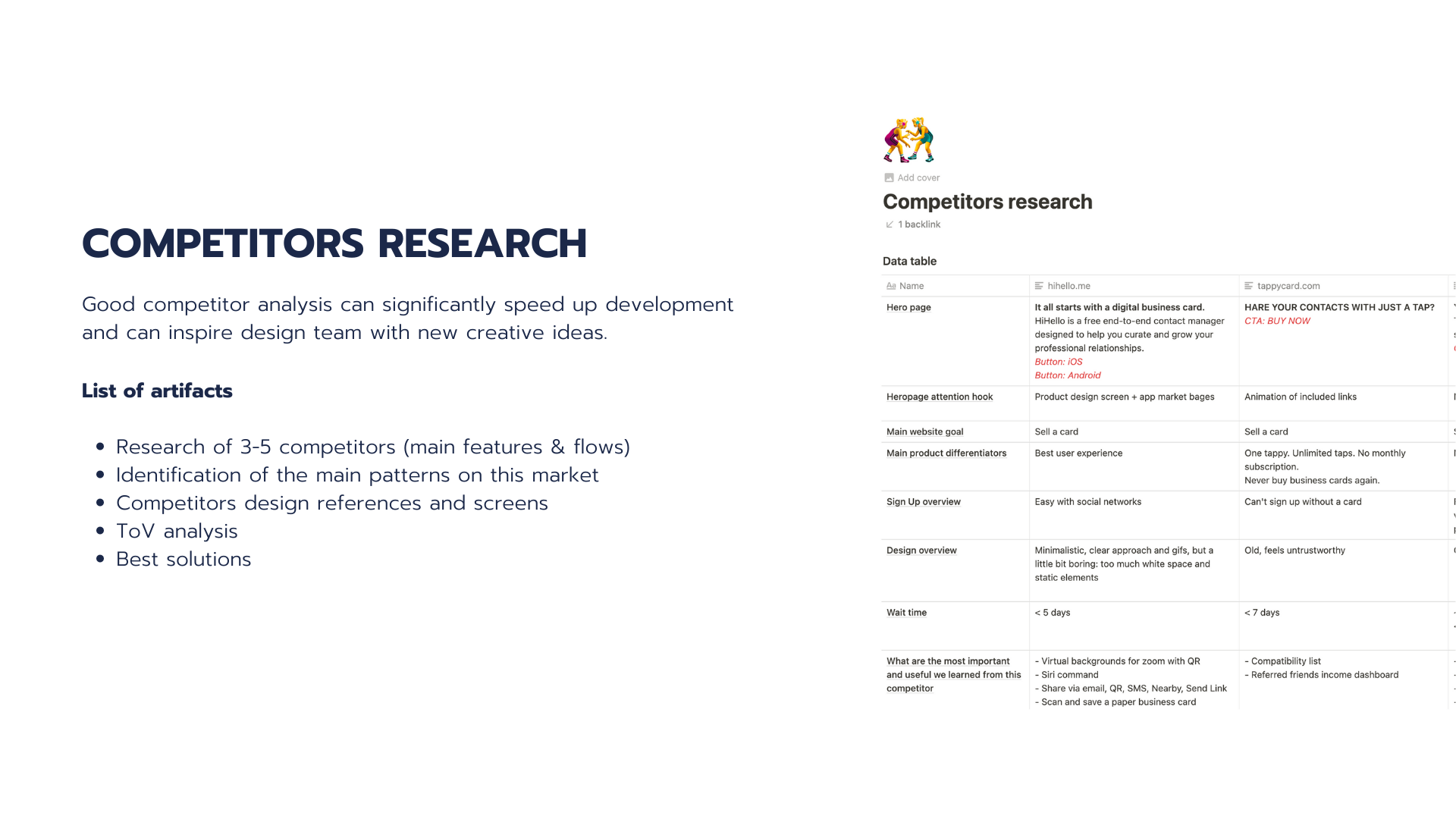
We usually research 3-5 competitors, their main features, and flows. This helps us identify the main patterns on the market our product will enter. We gather:
- competitors design references and screens;
- TOV analysis;
- best solutions.
Special interviews and support research
Interviews with support staff, most active users, clients who most often ask for help. Interviews with different departments and stakeholders. These interviews help us gather rare insights, spins, and ideas we wouldn’t get anywhere else.
Customer journey map
If the project is not too large and does not have too many flows we create a CJM. A journey map is a visualization of the process that a person goes through in order to accomplish a goal using our product.
We outline actions, problems, joys, and resentments about each step. This framework helps us both in designing new user experiences and in analyzing and correcting old experiences.
Jobs to be done
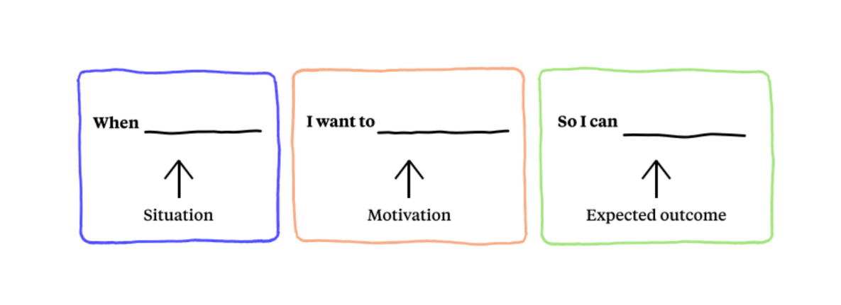
If the product is too complex and has too many use cases we opt for Jobst to be done. JTBD is a framework based on the idea that whenever users “hire” a product, they do it for a specific “job” (to achieve a particular outcome). The set of “jobs” for the product amounts to a comprehensive list of user needs.
Features prioritization
After all the hypotheses are validated and all the insights are gathered, we need to prepare for the actual design creation. This is when we prioritize the previously allocated JTBDs and transform research results into design tasks.
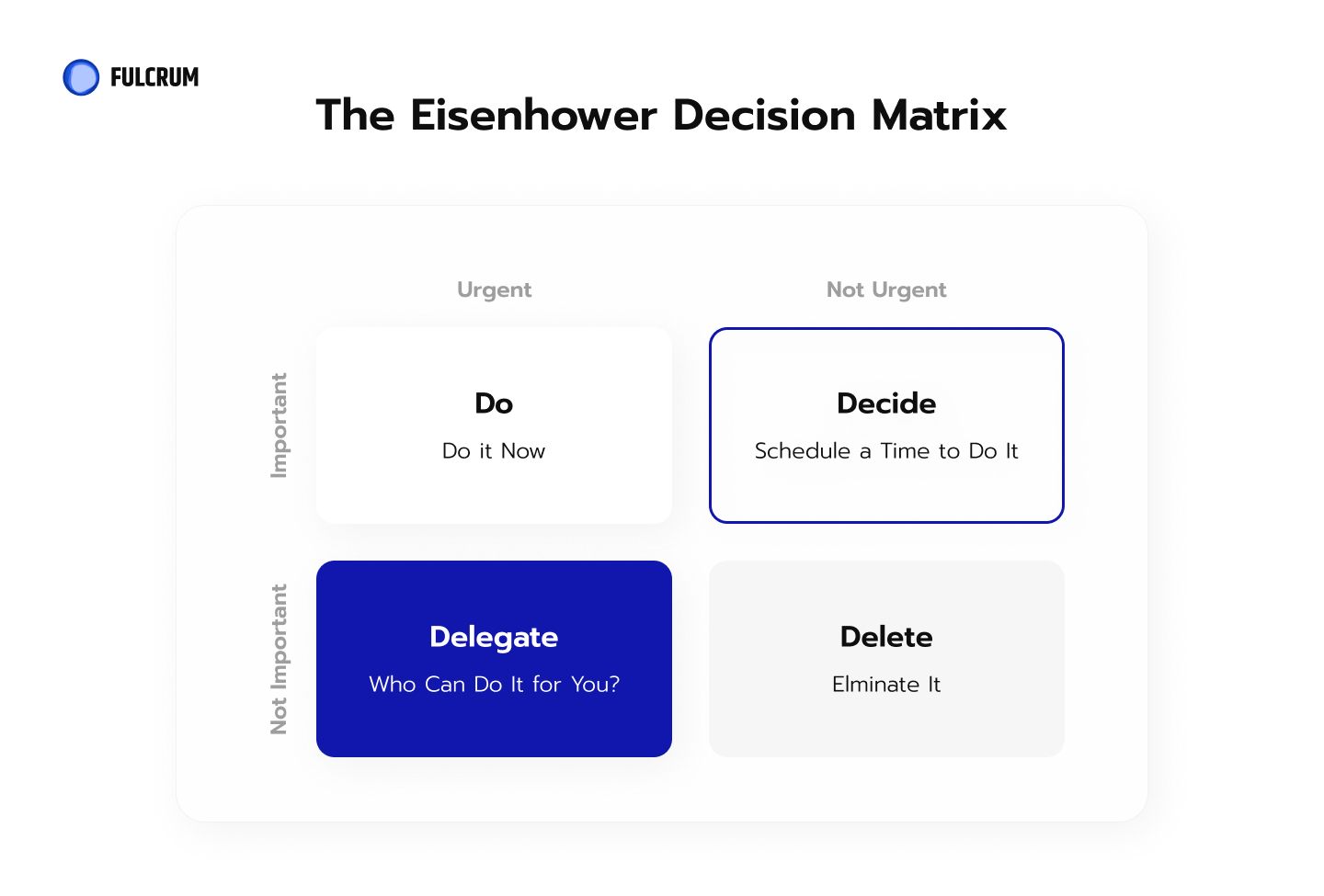
The resulting design tasks are estimated. Synchronized with the developers. And placed in the development queue.
Design creation
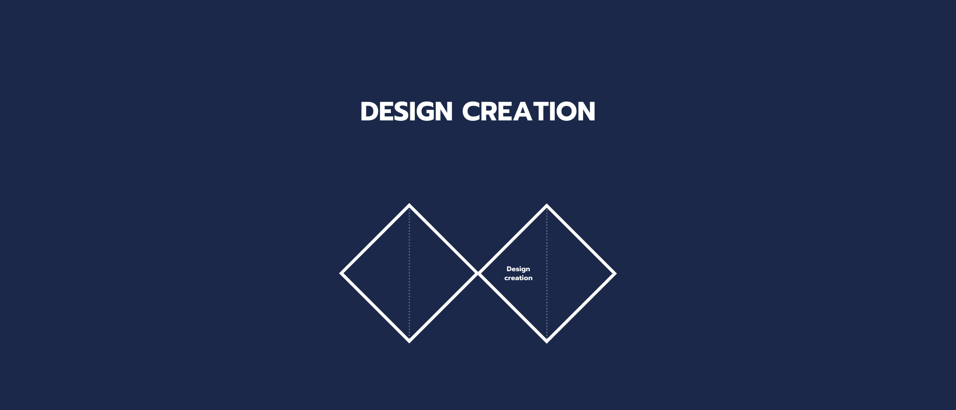
This is the fun part. We start with generating actual design ideas.
Brainstorming
Brainstorming is a method the design team uses to generate ideas to solve clearly defined design problems. At this step we come up with a list of artefacts. A list of ideas to implement. And a prioritization of those ideas.
Design concept
Before the MVP is ready we offer our clients beautifully designed screens of their app. They could be presented for stakeholders and investors. At this step we define the future color palette, choose fonts, icons, and visual style of the elements (buttons, fields, tags, etc.).
Wireframing session
This is an interactive online session to create sketches for the main flows of the product Figma or Miro. This is when we finalize the design concept.
Prototype
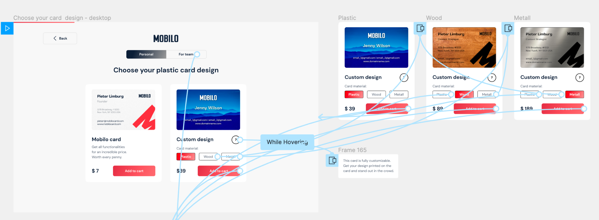
We create a black and white UX prototype based on the research insights and documentation created on the previous steps. The prototype usually includes:
- Screens of the main flows of the product.
- Basic kit of elements and styles of the project.
Delivery
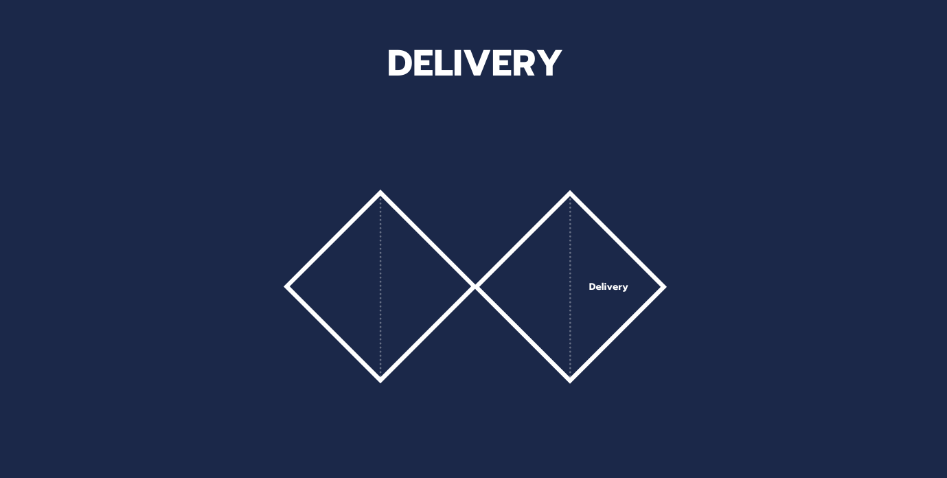
Nothing can be perfect on the first try. So we have to check if the product we are delivering actually solves the problems we identified.
Usability test
Usually, if the product already exists in some form when we start working on it, we do a usability test on the Info collection phase. Then we do a test after we deliver a redesign. And compare the results. If we create a product from scratch we naturally do not do a usability test at the start of the project. A usability test helps us to uncover unexpected issues, get feedback for the new concept, receive insights and ideas from the users. We also gather usability metrics.
UI kit
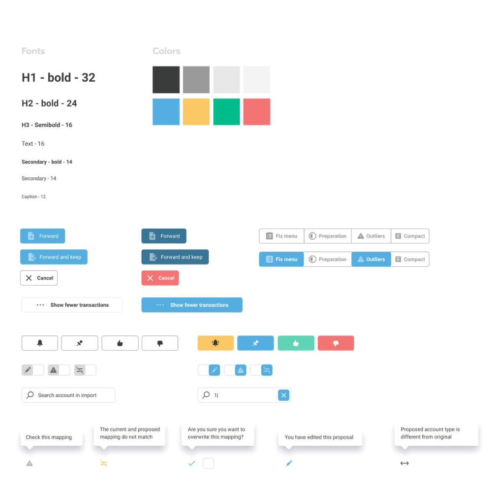
For the sake of consistency, standards, and better communication with developers we deliver a personalized UI kit. This will be a components library with all the necessary fields and forms, buttons and icons, typography and colors. All elements will have their rendered states.
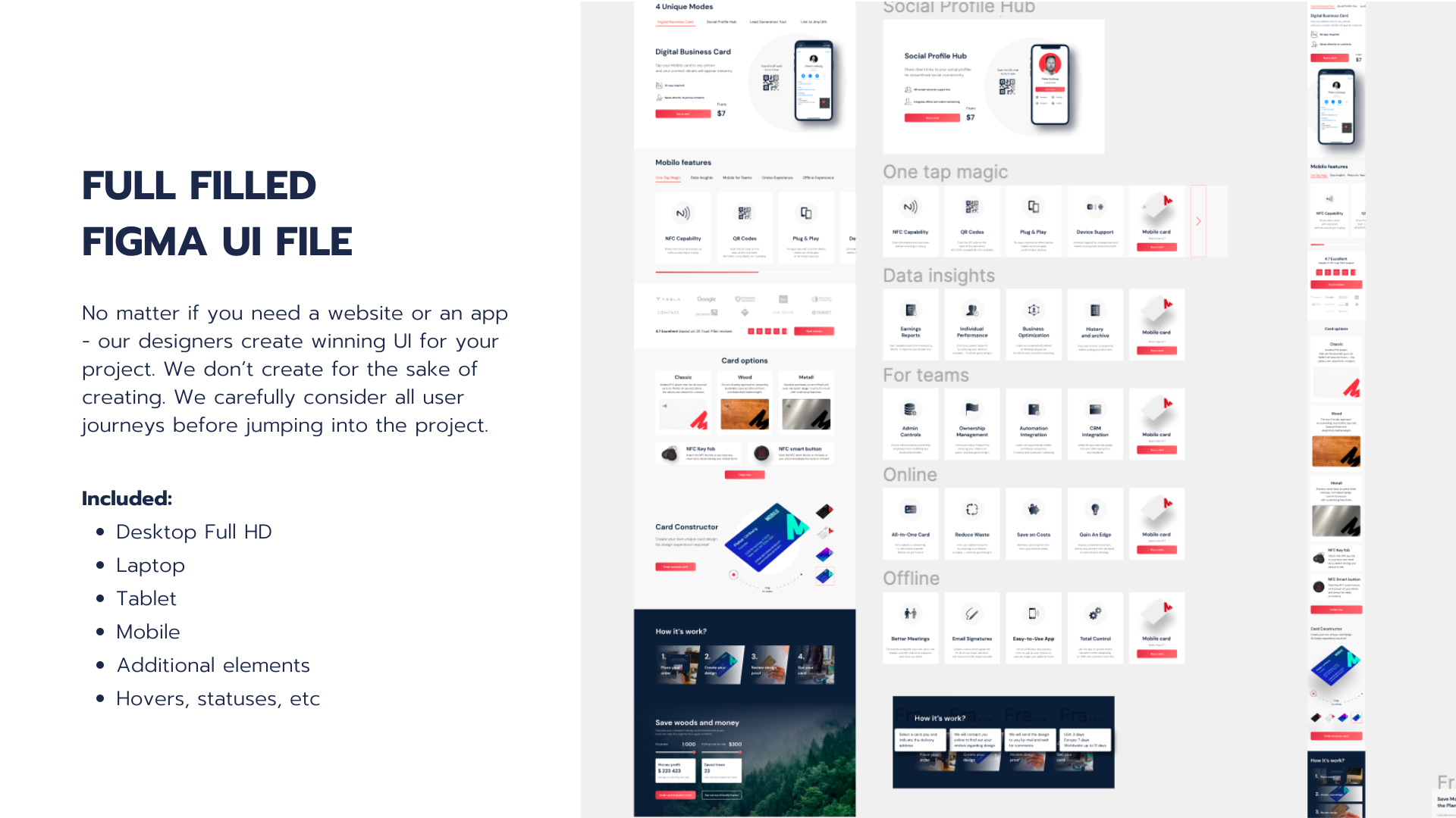
Full Figma UI file
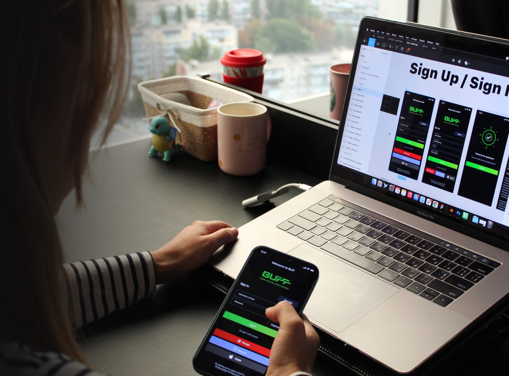
We carefully consider all user journeys before jumping into the project. So by the delivery phase we have a full Figma file which includes:
- desktop Full HD;
- laptop;
- tablet;
- mobile;
- additional elements;
- hovers, statuses, etc.
2D animations and micro-interactions
Our team is skilled in 2D Vector-based animation. This kind of animation is used on web, mobile, desktop platforms.
Micro-interactions are tiny animated events inside your app or website. They are small, but they delight the users and create better UX.
These small touches help us polish the final product and create a wow-moment for the users.
Illustrations
Illustrations can freshen up any design and give life to the app or website. They are also a great help in easily translating ideas to the end-user.
Brand identity
At the heart of any project is the corporate identity, which is necessary for brand recognition. If the project and client require, we provide:
- Development of positioning of the company relative to competitors.
- Moodboard for determining the style of logo execution.
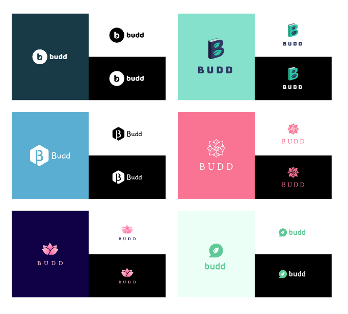
- Create multiple variations of your logo.
As you can see the design process at Fulcrum Rocks is thought through and consistent. Our interpretation of the double diamond model allows us to create great products for our clients and be proud of our work.
FAQ: Double Diamond Design
-
What is the double diamond framework?It is a popular design process model which implies these stages of design creation: Discover, Define, Develop & Deliver
-
What is a design process model?It is a framework that helps designers plan, organize, and manage the process of creating solutions.
