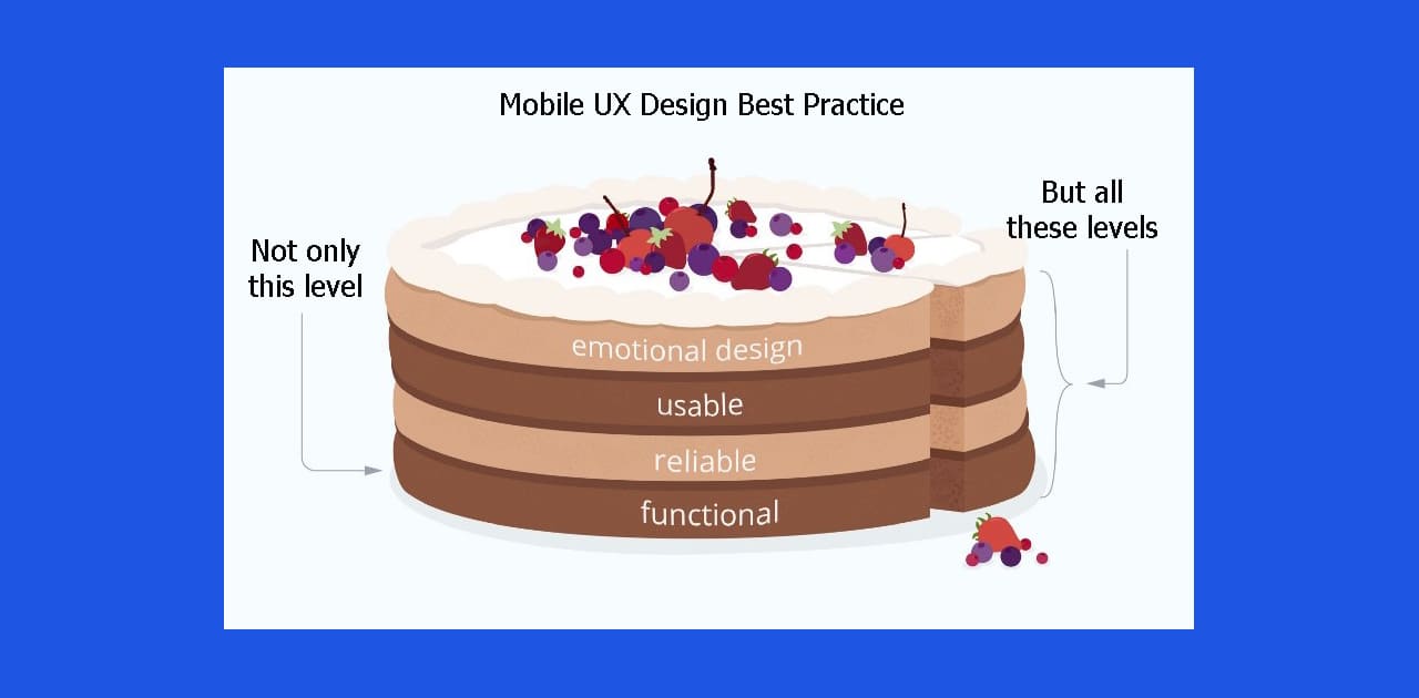
The more intuitive this interaction is, the more satisfied your user will be. And the higher chances for conversion you will have. Mobile UX design is an area that improves the process of using a website and simplifies complicated steps. As a result, you decrease your expenses on attracting new clients. Additionally, customer loyalty to your brand is enhanced.
Mobile UX these days is more important than the desktop experience. Stats don’t lie: mobile market share has already suppressed the desktop one, and is estimated to grow further. So how do you design an app that is guaranteed to make the users happy? Let’s find out.
Mobile UX Best Practices Every Designer Should Know
During the design process, even the most experienced designer might miss out on some stages in the users’ flow. Some visual elements might go unnoticed. It’s a natural and inevitable part of all development processes.
But those little (or sometimes big) details can do a lot to ruin a good impression. Luckily, there are UX design principles and best practices you can always check yourself with.
1. Make the Text Readable
Optimizing typography is optimizing readability, accessibility, usability(!), overall graphic balance.
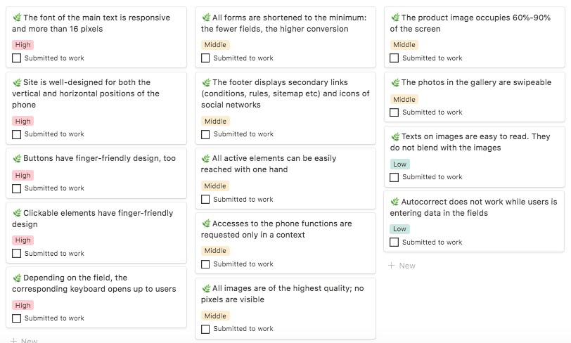
The font of the main text should be responsive and more than 16 pixels. If your target audience is older than 35, then the minimum text size should be 18px. Website fonts should be easy to read at the usual distance from the user’s eyes (20-30 cm for mobile phones).
2. The Site is Well-designed for Both the Vertical and Horizontal Positions of the Phone
Your website’s design should be adapted to all the screens and device positions. It is especially relevant to using a website via mobile phone.

3. Clickable Elements are Finger-friendly for Mobile Users
Clickable elements must be designed according to UX guidelines and be easy to tap with the finger. Besides, your users must always be able to see that these elements are clickable.
 Left: properly-sized button. Right: buttons are too small. Image: Apple
An average finger pad is 10–14mm and fingertips are 8–10mm. That’s why a perfect minimum touch target size is 10mm x 10mm.

More tips:
- Make buttons look like buttons (users need to know instantly what is ‘clickable’ and what’s not)
- Put buttons where users expect to find them
- Label buttons with what they do
- Avoid using too many buttons
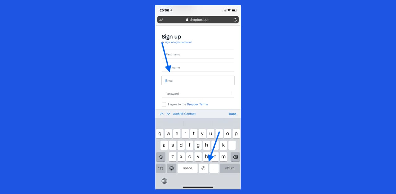
4. Depending on the Field, the Corresponding Keyboard Opens Up to Users
If a user needs to enter a phone number a keyboard with only digits should pop up. And when a user needs to enter their email, the keyboard with @ sign opens up.
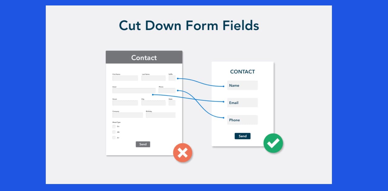
5. Сut Down on Form Fields
The shorter the form the better. Limiting the number of fields in your form makes it easier to fill out, which can therefore increase your conversion rate. Don’t overload your users with the fields and requests.
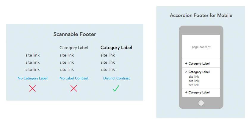
6. The Footer Displays Secondary Links (Conditions, Rules, Sitemap, etc) and Social Networks Icons
Properly designed footers can greatly enhance users’ experience. Users often scroll to the bottom of a page and expect the hard-to-find content to be there. It’s crucial to meet your users’ expectations.
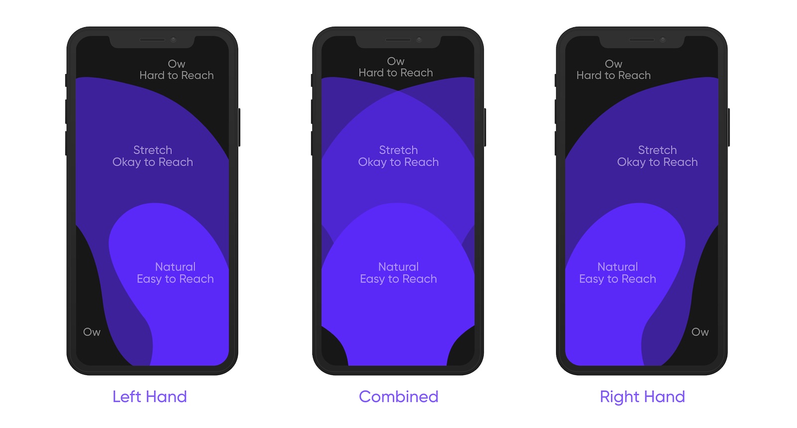
7. All Active Elements Can Be Easily Reached with One Hand
Quite often, users hold their mobile phones just with one hand. So, your task is to arrange all the active elements on your screen in a way that lets the user reach them with the fingers of one hand.
8. Access to the Phone Functions is Requested Only in a Context
We are talking about camera access, geolocation, and notifications. The system should request such access in the context of performing a certain task. Not all at once.
9. All Images Are of the Highest Quality; No Pixels Are Visible
Images are one of the most important factors that make your website pleasing to use. So, make them good-looking, stylish, and of high quality.
10. The Product Image Occupies 60%-90% of the Screen
To attract users’ attention to your product you need to make it visible enough. Make your product image stand out among all the other elements on the screen.
11. Texts on Images Are Easy to Read. They Do Not Blend with the Images
The text has to be readable. You can achieve it by selecting a proper contrast, typography, text size, etc.

12. The Design of the Application is the Same as on the Screenshots on the App Store/Google Play
This seems obvious. Yet, sometimes screenshots in the App Store/Google Play are not updated. It may confuse and even disappoint your users.
Mobile Design Techniques That Boost UX
The best practices and general UX rules are great. But what if you want to experiment? What if you need the design to be more innovative? No worries. Your design can still be creative and provide a great user experience. Here’s an example of just a couple of innovative mobile design techniques that have been proven to boost UX.

Navigation Menu at the Bottom
Bottom navigation is a true game changer when it comes to handheld devices. The bigger your iPhone gets with each new release, the harder it becomes to navigate websites and apps with just your thumb. Bottom navigation menu solves this issue quite elegantly.
Gamifying the Routine Processes
Any website has routine processes that can annoy the users. And even make them leave your website. Things like loading screens, shipping flows, and preparation stages take time to execute. The waiting time is an especially sensitive issue for eCommerce websites.
Other examples of taxing user experience are swiping and scrolling. If a user has to swipe a lot of cards within an app to achieve their goal it is a great idea to gamify or animate this process. Moving parts grab the user’s attention, so they are less likely to lose interest. And the chances of them getting to their final destination within your app get higher.
Mobile UX Design Constraints
A mobile website or app is a very limited space. Inevitably, there are functional constraints, things you simply can not do in your mobile version design. UX has to take them into consideration.
Things like client-side storage, small screen sizes, the rules and limitations of the platforms themselves, make it hard to deliver a user experience similar to the web UX.
While at first sight this seems like a limitation, there are examples of UX constraints leading to major wins. Take Twitter. They had to limit messages to 140 characters. But over time this constraint became a feature. Something that made Twitter unique. And enormously popular.
The Best Way to Make Sure Your Mobile UX Design is Up to Par
All this mobile UX design business might be a bit overwhelming. Especially if you are not a UX designer with decades of hands-on experience. Luckily, there is a way to check your mobile UX without hiring an in-house UX specialist. We are talking about the UX audit.
It doesn’t matter if your company is small or big, every online project can benefit from a design audit. Especially if it’s a startup looking to validate its MVP. Another case when UX audit is a must is redesign of an old website or app. It’s a great opportunity to check and improve your visual design materials, elements, and written messages. UX audit will help you estimate existing user flows. To detect problems, or bottlenecks that take away the conversions and stop users from performing the desired actions.
Of course, a UX audit is also a good idea when you plan on adding new functionality too. It will help you estimate if the new functionality is a valuable addition to your product and whether it will simplify the users’ flow.
You may also implement a UX audit to estimate a new product design before its development. It’s very useful because at this stage you are still able to make changes that will not waste much time and not cause financial losses.
A goal of an effective UX audit is to remove issues and create an easier and more smooth user journey. It can help increase user engagement, conversions, and satisfaction.
A mobile UX design audit is like a financial audit. Even when you are sure everything is clear and seamless, you’ll sleep better after it’s double-checked.
Free UX Audit Checklist
UX audit is not only about pointing out the mistakes and inaccuracies in a UX design app. It is also about offering solutions to avoid those pain points.
We at Fulcrum.Rocks love to be helpful for our clients and readers, so we have created a FREE UX Audit Checklist with “how-to” information. This checklist is an awesome knowledge base on what items to check and how to improve them.
 Free UX audit checklist by Fulcrum will help you define the UX bottlenecks of your app
Looking for an Expert UX Audit?
A successful audit helps to see a clear picture of strong and weak points in the current product experience. It can help understand what to focus on in future design enhancements. We’ll provide a detailed analysis of your website or mobile app. UX audit by Fulcrum.Rocks will help you prioritize the most critical UX issues to be fixed and developed. What it entails is:
- 1 week-long
- 100+ UX criteria analyzed
- audit of all product’s pages
- hotline and tech support check-up
- wireframes with usability fixes


