UX is no longer a flash in the pan, it’s a must-have. Back in 2016, Forrester noted in its report that “$1 invested in UX will bring $100 in return.” In 2021, there is hardly a developer who needs proof of ROI investment in UX.
A well thought out UX design contributes to a long-lasting customer/business relationship. Users are more likely to come back to a website where they have already had a positive experience.

Is the idea of the well-conceived UX design still relevant in 2022?
Business owners keep on investing in the “look and feel” of the website because:
- 88% of the users wouldn’t return on the website where they had a bad experience;
- 90% stated that they already gave up on the app due to its poor performance;
- the chances that a user of the website with poor performance will purchase anything from the brand are 62% lower.
Insights are taken from the article by Miklos Philips.
Globally, a well-developed UX design shows that the user’s needs and comfort are taken into account, which helps build trust. Specifically, it increases user satisfaction, improves interaction, and makes a person stay on the site and return.
To organize your UX audit efficiently, Fulcrum created a free checklist for UX audit. With it, you will be able to audit the UX design of your website/app on your own! By following simple guidelines, you will define the problems in visual design, web forms, user/website/app interaction, and much more!
What is DIY UX audit checklist and how to use it?
The UX audit checklist is divided into two levels – junior and medium. Each level has categories that correspond to the components of the UX design (e.g web forms, visual design, visibility of system status, etc.).
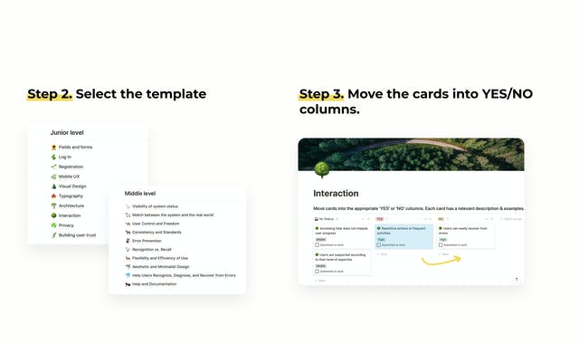
Each category has cards with statements that describe the ideal state and parameters of the components of the UX design.
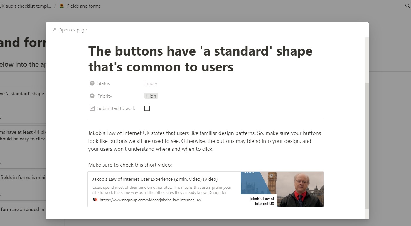
For example: “The buttons have “a standard shape” that is common to all users”. If the statement is relevant to your website, that is if all buttons on your website have “a standard shape”, you move the card to the nearby “Yes” column. Otherwise, you move the card to the “No” column. The cards in the “No” column represent the problems in the UX design.
Moreover, by clicking on the card, you will open its description, see the examples and tips for improvement.
The next step lies in submitting the list of issues to the designers and developers.
Before we move to the detailed overview of the checklist, let us answer the “Why is this checklist worth my attention?” question:
- opportunity to audit UX design of your site/app and detect 90% of issues;
- 100+ unique cards;
- extreme ease of use;
- no special software needed;
- doesn’t require serious tech skills;
- is compatible with Notion;
- will stay with you forever;
- highly rated on ProductHunt – a product of the week;
- is free.
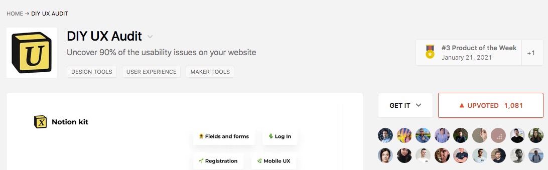 Our free UX audit Checklist at ProductHunt
Now, let’s have a closer look at its functionality.
Free UX Audit Checklist by Fulcrum Rocks – Junior Level
With the help of the cards in this template, you will be able to audit the main website’s/app’s elements.
Fields and Forms
Fields and Forms – 10+ criteria estimate such properties as color, form, size of the fields and buttons, space between them, their position, etc.
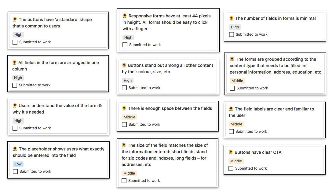 Fields and Forms UX Checklist
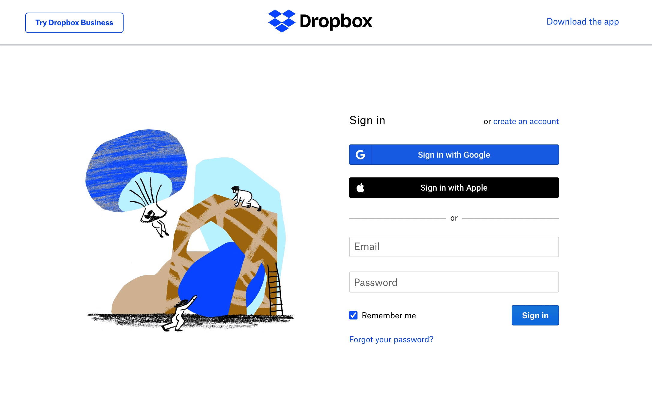
Login & Registration
Login & Registration is a set of cards that evaluate the work, look, and functionality of login and registration forms. Check these must-haves for the perfect “Log in” page:
- log in/sign in via social networks
- ‘Create an account’ option
- Forgot password option
- ‘Log In’ or ‘Sign In’ heading
Mobile UX
Do pages look good in all positions of the phone? Are forms, footers, and headers, images, and active elements displayed correctly? Does the keyboard open correctly in all fields? 15+ cards assess how mobile-ready is your website.
Visual design
Visual design is a broad category. It has 28 cards for checking out concrete things such as the design of alert messages, interactive elements, menus, positions of blocks of information, typefaces, etc. Another part of the cards evaluates such abstract categories as the “clickable” look of the objects, the look of the content, icons, buttons, and whether it reflects certain ideas.
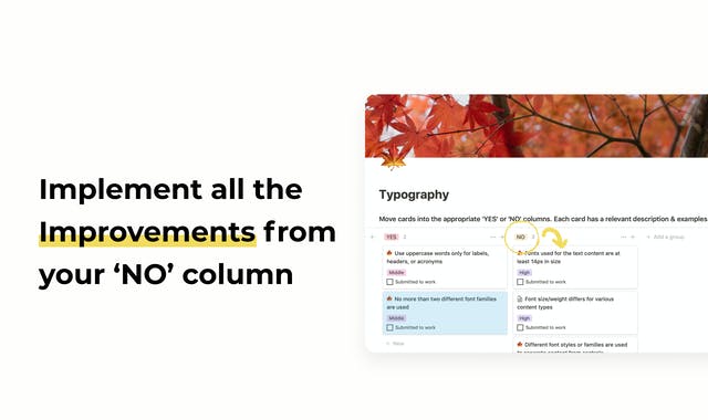
Typography
5 cards to detect any issues with fonts:
- Font size/weight is different for various content types
- Fonts used for the text content are at least 14px in size
- Different font styles/families are used to distinguish content from controls
- Uppercase words are used only for labels, headers, or acronyms
- No more than two different font families are used
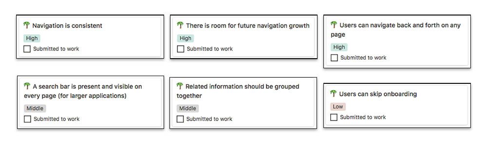
Architecture
6 criteria to estimate the convenience of navigation:
Interaction & Privacy
The Interaction category helps to understand whether the users will feel comfortable when they need help or make a mistake;
The cards in the Privacy template estimate the state of the SSL certificate and cookies:
- SSL certificates
- Permission request to use cookies
- Option to refuse using cookies
Building user trust
Does your website have full information about you/your team/your company? How well does customer support work? Are client reviews arranged correctly? You will find the answers in the Building user trust category.
Free UX Audit Checklist by Fulcrum Rocks – Middle Level
The Middle-level audit deals with more complex criteria of usability. They cover visibility of the system status and its match with the real world, consistency and standards, error prevention, user control, etc. A comprehensible description of 10 usability heuristics can be found here:
Despite the complexity of this stage of the audit, you will still be able to check out vital elements of the UX design with our checklist. So, the Middle level consists of the following categories:
Visibility of system status
The statements help to define how understandable and transparent your website is and how much control will the user have. The more information about its status the system gives, the more satisfied the user will be. The cards help to check out, for instance, whether the terminology of menu items is user-friendly or whether the loaders imply how much it’s left to wait.
Match between the system and the real world
Are all terms clear, all questions unambiguous, all hints understandable, all icons reflect the idea of the elements? You will be able to check out if the user and the system speak the same language.
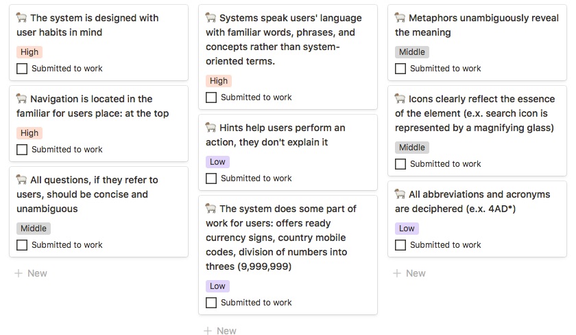 Category: Match between system and the real world
User Control and Freedom
To check out if the user has enough freedom and control over such actions as deleting an account, making backups, canceling any processes, you will go through the statements in the User Control and Freedom category.
- Can users delete their accounts?
- Is there a cancellation feature if it’s needed?
- It is possible to cancel the process?
- Can users edit information about themselves?
- Are there breadcrumbs to provide navigation for multilevel processes?
Error Prevention
Sorting out the cards in the Error Prevention category will help to test how well a system helps users prevent errors.
Recognition rather than recall
Recognition vs. Recall cards help to audit navigation in a deeper sense. You will check out if all elements are easy to find and if all of them perform their functions in full. Does the main logo look the same on each page and does it lead to the main one? Is website navigation similar to other websites? Is all information visually available and doesn’t require remembering? The answers to these questions will help to detect problems with navigation and make a website/app more intuitive and comfortable.
Help users recognize, diagnose, and recover from errors
Will the users get proper assistance or understand how to solve an issue once they face it? You will figure it out when sorting out the cards in the Help Users Recognize, Diagnose, and Recover from Errors template.
Help and documentation
The cards from the Help & Documentation category will help to detect issues with instructions, hints, help instruments, and documentation.
Consistency and Standard, Aesthetic and Minimalist Design, Flexibility and Efficiency of Use are coming soon.
Grab your free UX Audit checklist now:
To get a free checklist all you need to do is:
- visit this page and click on the Unlock for Free button;
- enter your email address;
- get a checklist within a few minutes;
- open it in Notion and start an audit.
That’s how a well-conceived audit of the UX design of your website can be done. For free.
UX audit from Fulcrum Rocks
If you need help with a check-up, you can proceed to the Senior level where Fulcrum designers and developers gladly assist you! Everything you need to know about UX Audit from Fulcrum 👇

What does it include?
- Analysis of behavioral patterns of your target audience
- Extended audit using all the metrics from our checklist with real-life examples of how it should be done.
- Wireframes showing how usability issues can be fixed
- Quality Analytics audit
- Hypothesis to be checked during usability testing
- Analysis of hotline & tech support inquiries
- Extended audit of all adaptive versions of your websites
We’re ready to provide a super detailed analysis of your website/ mobile app issues with recommendations on how to fix them. Just, let’s talk business!

