Does the world need another social media app? Looking at giants like Twitter, Facebook and Tik Tok one might think that that ship’s long sailed and there’s no market for another one. But people do want more social media, and from time to time, some of them launch with the wild success. Sadly, 90% of the new apps fail. For example, like Clubhouse did.
If you have social media app ideas that don’t let you sleep at night. But first of all, let’s find out how do you make it happen and not fail before the app even hits the market. In this post, we’ve collected the major harmful actions in developing and launching a social media app.
Don’t Do the Discovery Stage
Of course, every app is unique and has its unique reasons for failure. But we’ve been in this business long enough to distinguish the most common risks.
A brilliant idea is not enough reason to go ahead and create an app. Even if you are very sure of your idea. And have already hired a team to build the app. There’s a ton of work that needs to be done before the designer even starts sketching the first screen.
One of such things is the discovery phase. If you want to create a social media app that will definitely fail, go ahead and omit this part of the development life cycle.
The discovery stage is the foundation of any successful business. This is when we determine the product vision and business goals. When we build the product architecture that will help us achieve those goals and support that vision. Here’s also when we identify the possible risks and mitigate the costs of development. And create the roadmap for the future product.
Go in Without Product Market Fit
The success of Tik Tok and Clubhouse heats the imagination. But they haven’t just stumbled upon it. It’s the result of detailed research and meticulous planning. In other words – they have found their product market fit.
It’s easy to understand when you don’t have it. Your users don’t understand the product’s value. They leave fast and never return. The sales are low. There’s no word of mouth. If this is the picture you want to see when you release your social media app then go ahead – straight to the AppStore. And hope for the best.
However, if your goal is to succeed you need to do some research before developing the app. You have to have a thorough understanding of your product, your target audience, and your market. Find the users’ pains and needs and satisfy them with your social media app. If you do it right you won’t need marketing budgets. Your app will go viral and sell itself.
Don’t Define the Monetization Model
How are you going to make money with your app? Will it be a freemium model, or in-app purchases, or both? Or maybe something entirely different? You have to think about the monetization model before the app is built.
Otherwise, you’ll just drain your resources and redesign the app to fit a new monetization strategy every few weeks.
Don’t Think About UX
Your designer can create a beautiful design for your social media app. With the colors you like. And the buttons you want. But if the user experience is lacking, your customers will get frustrated with the app. And leave forever. And tell their friends what a bad experience they’ve got from you.
If that’s not what you are after you have to think about UX when designing the app. Hire an experienced UX designer. Do UX research or audit when your MVP is ready. Don’t forget about UX when you release updates and new features.
How we create a social media app in Fulcrum
You might have guessed already – we do it by the book. We go through every software development lifecycle stage. We do extensive, thorough research. We find the elusive product market fit for every project we take on. Why don’t I just show you? Here’s a couple of social media apps we created:
Hyfa
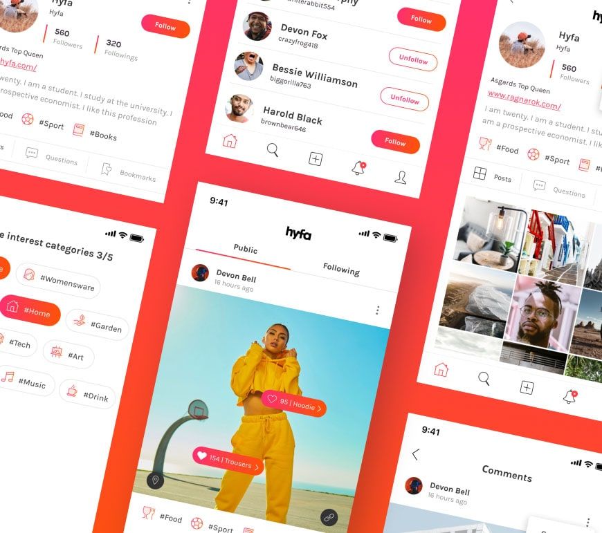
Hyfa is an Instagram for shopping. A social media for users to discover, curate, and share products and services. Hyfa founders came to us when the app was already built but performed very poorly. We redesigned the app, changed the backend completely, and updated the business strategy to fit the company’s vision and goals.
Features:
- Various colours for tags and links which the user adds to the photos
- A possibility to share posts on popular social platforms
- Comments to the user’s favorite posts and likes to specific picture tags
- Clickable product tags to the photos, so that the user’s friends could explore the products themselves
- Social feed made up of the posts with the user’s favourite categories and profiles they follow
- A multi-linking feature which allows to add extra information to the photos and leave up to 10 links for each picture
- Personal profile with the photos of the user’s favourite products, services, and experiences
- In-app direct links to the products and shops the users like
Front-end stack: React Native, Redux
Back-end stack: Node.Js, Nest, PostgreSQL, Redis, AWS, Firebase
Read more: Hyfa case study
Plannly
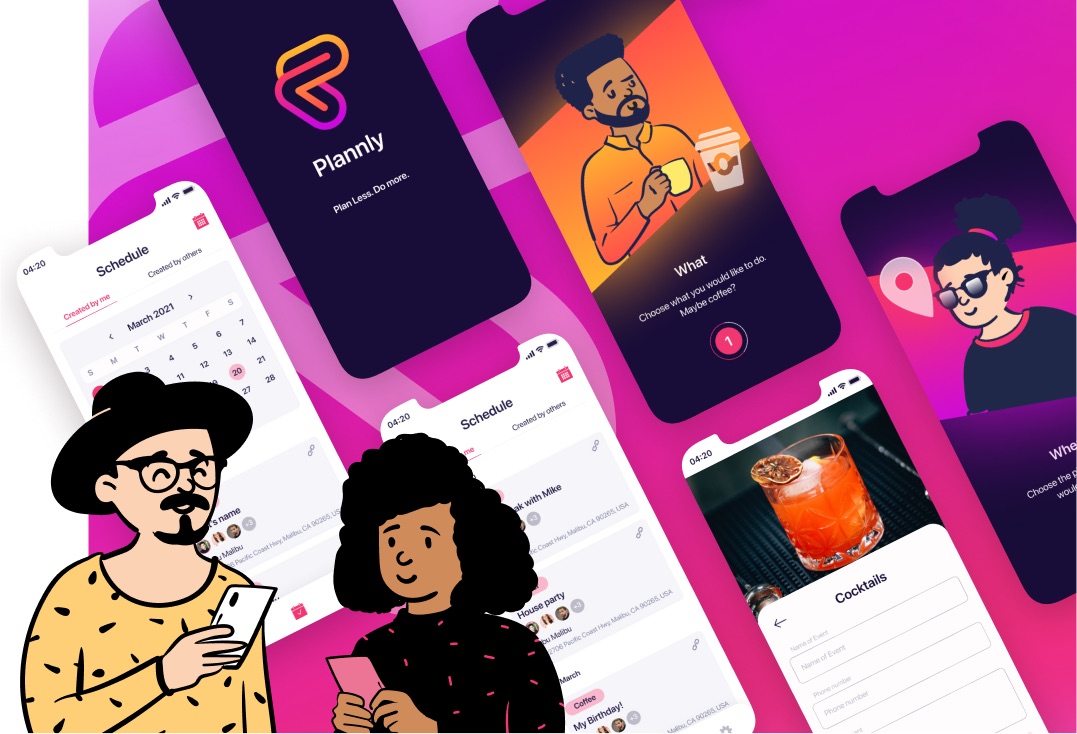
Plannly is a social events planning app. It allows users to plan their social gatherings and events in 3 simple steps. In short, the users can easily plan Where (location/venue), When (date/time), and What (type of event) they want to do. And send an invite to a guest in under 60 seconds.
Features:
- quick and simple on boarding to teach users
- smooth and user-friendly sign up and log in
- calendar for personalized and universal events
- functionality to choose the type of the event users are planning
- a convenient location auto-population feature to pick the venue
- the app syncs up to Google and hand-delivers the best places within a 15 mile-radius
- universal and personalized link sharing
- detailed overview for each event
Tech Stack
Front: React
Mobile: React Native
Back: Nest, Node.js, MongoDB, Redis, Firebase, GCP, Typescript, Docker, Kubernetes, AuthO
Reechr
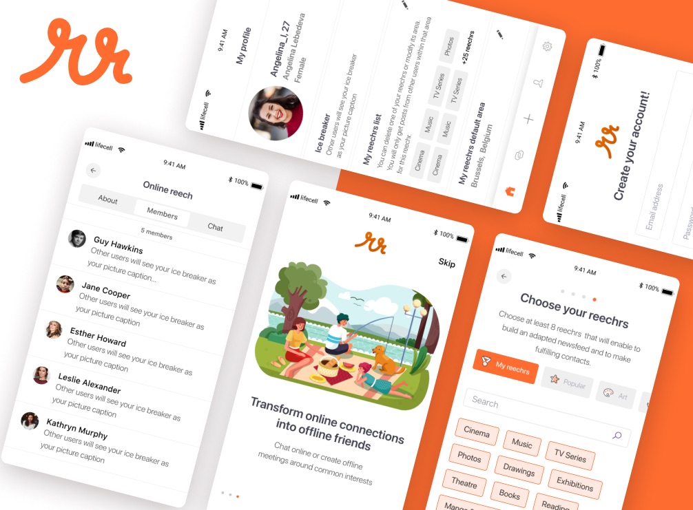
Reechr is a social network that helps people to connect with each other both online and offline. The app matches people based on their shared interests and location. It enables instantaneous interactions via chats, geolocalized events, content sharing, and offline meetings.
Features:
- Smooth onboarding which allows users to learn the app’s functionality faster
- User-friendly and simple signup and login
- Users can add their areas of interest to personal profiles
- Based on their interests, users can create local and dynamic communities
- Users can share and visualize their content
- Users can discuss their passions with others via messages
- Users can meet and befriend other Reechr members offline
- Users can create and organize events and invite their community to join
Tech stack
Mobile app: React Native, Typescript, Redux, Socket.io, i18next
Integrations: Google Maps, Google Places, Google Geocoding, Google AdMob, Mixpanel, Firebase, Google cloud platform (GCP), Mongoose atlas
Back-end stack: Node.js, Typescript, Nest.js, MongoDB, Redis, Docker, Kubernates, Jsonwebtoken, Swagger.
DOIT
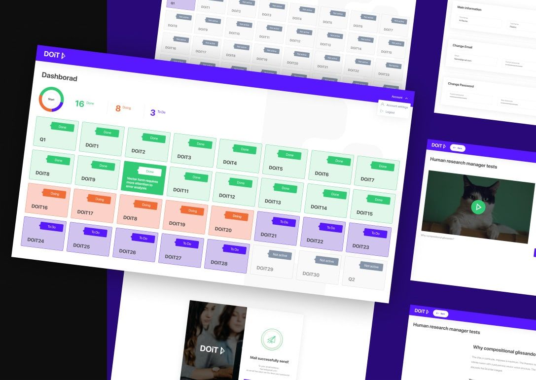
DOiT is an adaptive platform for learning. It features various assignments for corporate employees who want to improve.
The platform also includes a smart admin panel for managing user groups & creating ‘DOiTs’.
DoiT Case: How we created an e-learning website that helps employees train soft skills.
Type of app: web platform + admin panel
Front-end stack: React, Typescript, Redux, i18next, Material-UI, Recharts
Back-end stack: Node.js, TypeScript, Nest.js, PostgreSQL, AWS EC2, AWS S3, AWS RDS, Docker, docker-compose
Bloss
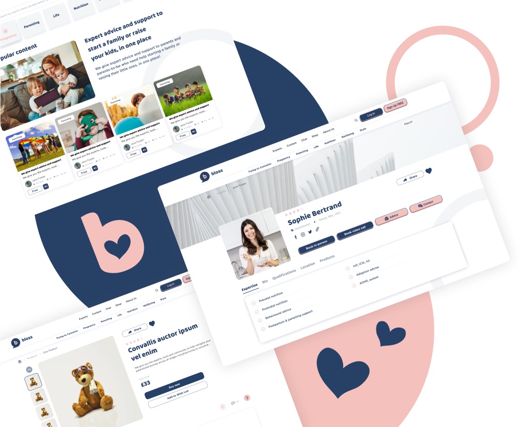
Bloss is an education and lifestyle platform that helps parents and parents-to-be with starting a family and raising their little ones, whilst enabling experts to grow their business.
Its mission is to connect people to a one-stop-shop of credible, trusted, and user rated professionals across their entire journey (from TTC, pregnancy and parenting from baby to a teenager).
Bloss Case: How to create educational website design that blows away
Type of app: web platform
Front-end stack: HTML5, CSS3, SASS, JS, GULP
Back-end stack: PHP, MYSQL
Integrations: WooCommerce, PayPal, Stripe, GA, bbPress, Yoast SEO, Advanced Custome Fields, Easy Bookings
